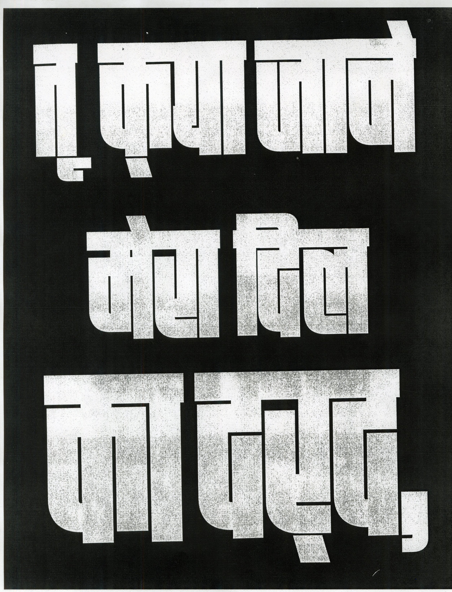
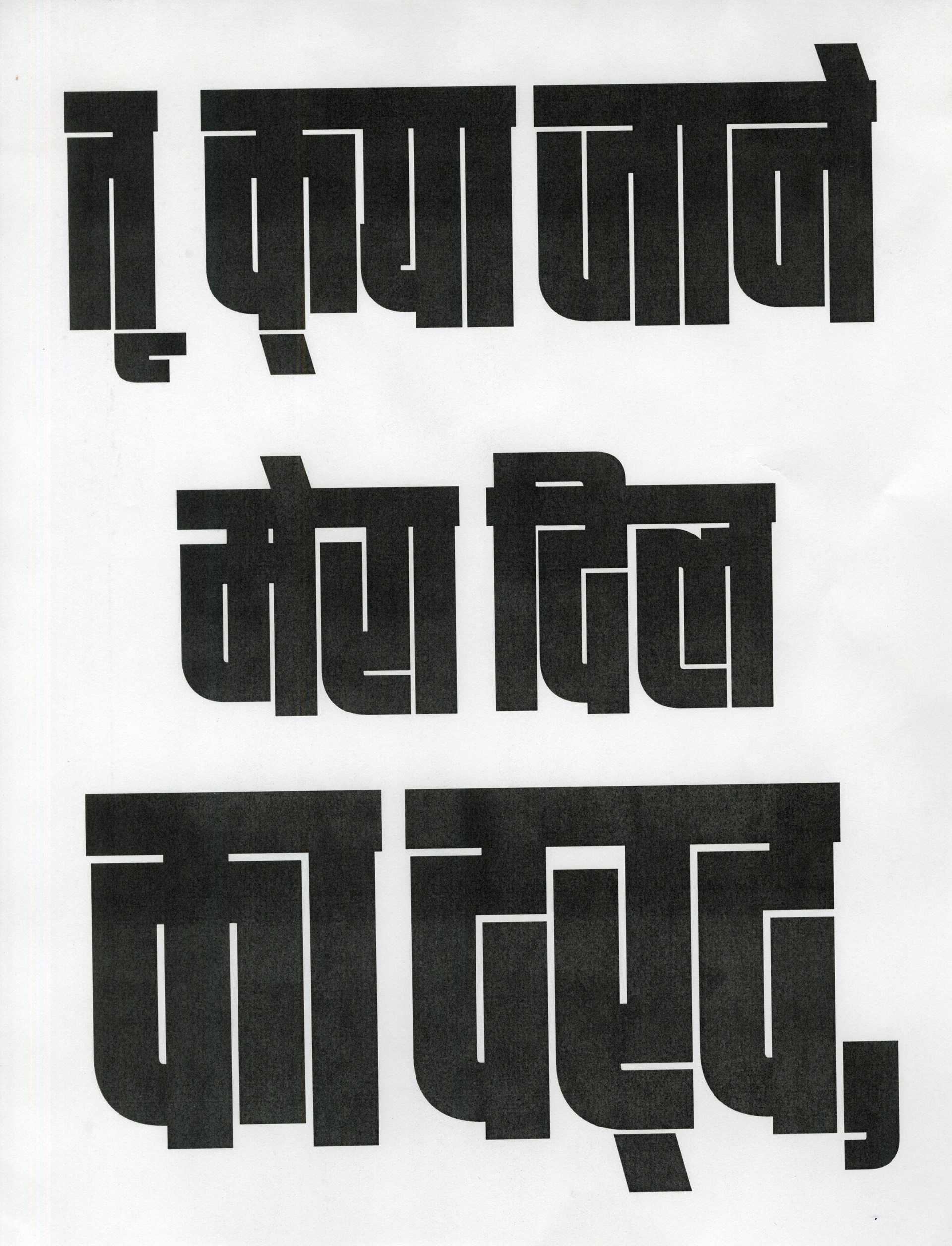
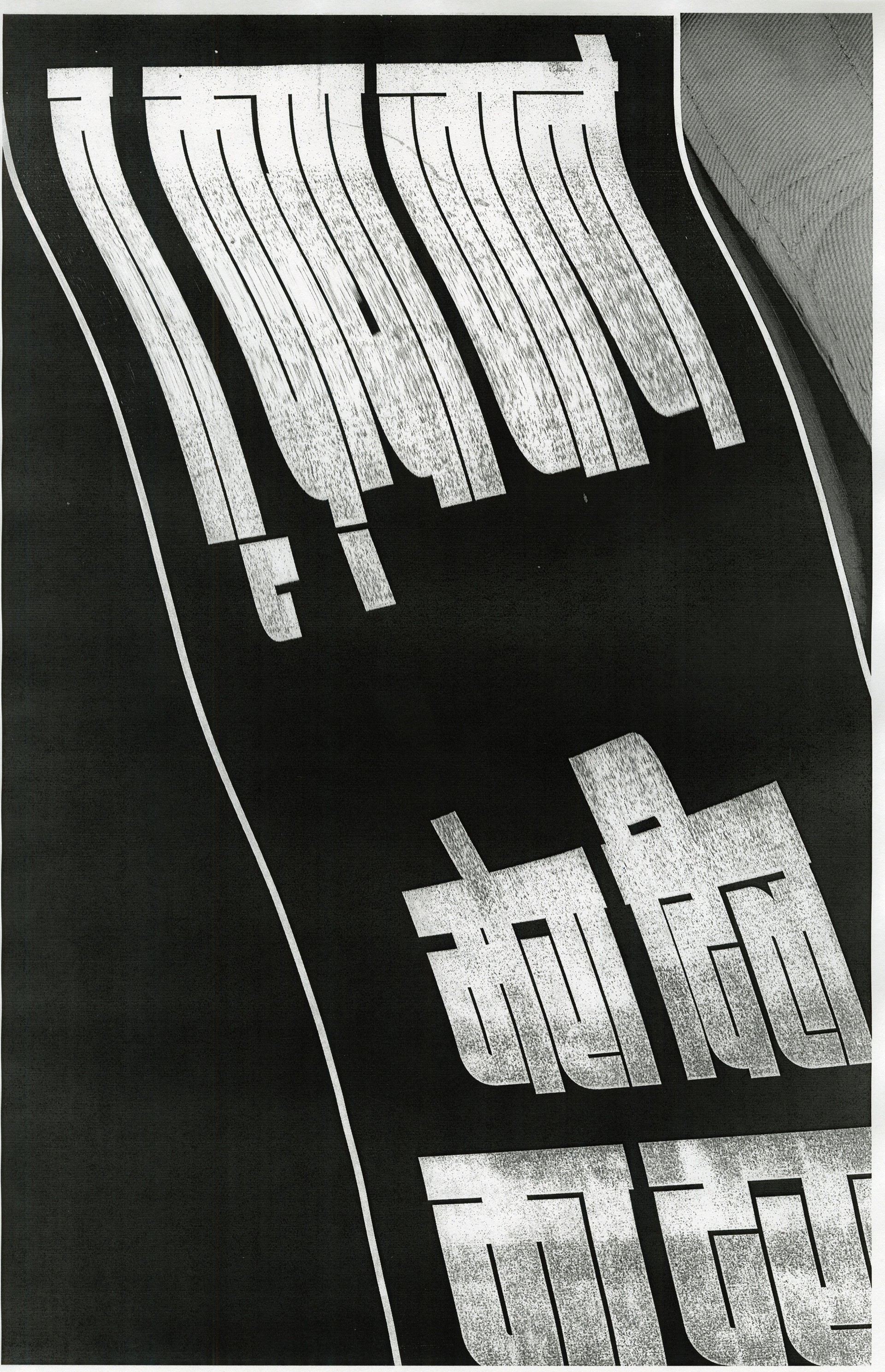
initial explorations
Focused on creating a typographic design with clear hierarchy and a compelling layout, exploring the communication between text meaning and typography manipulation. Researched Hindi typography to ensure modifications didn’t hinder readability, while experimenting with design.
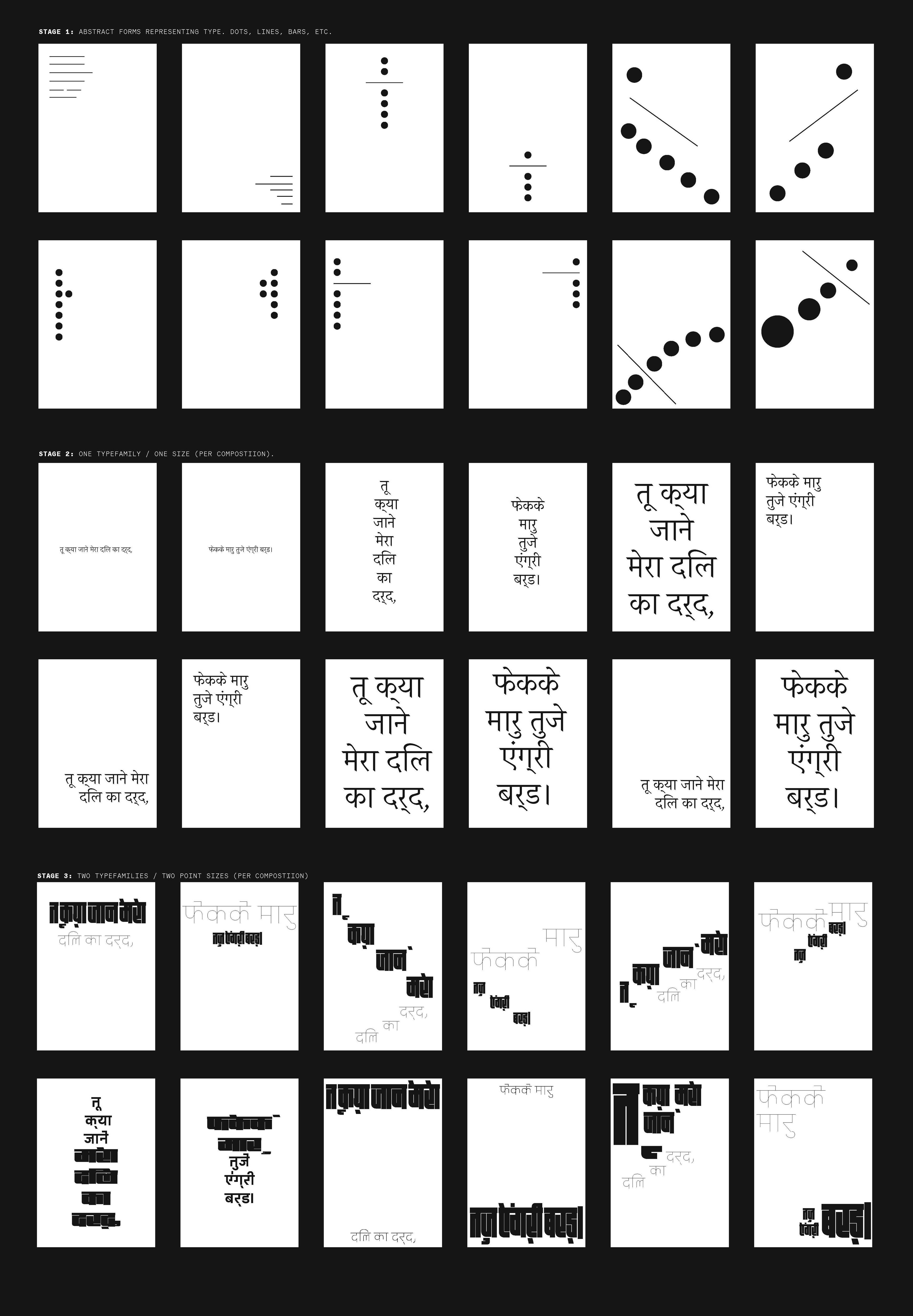
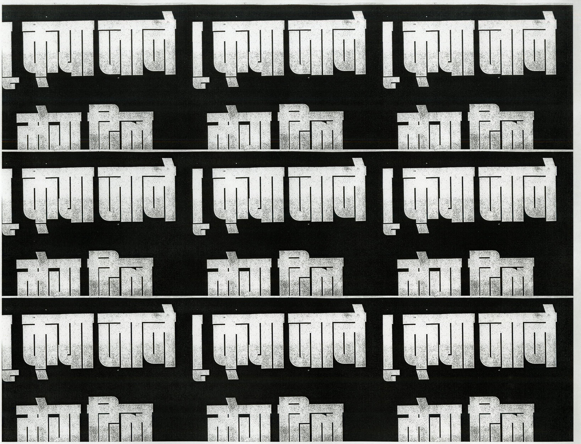
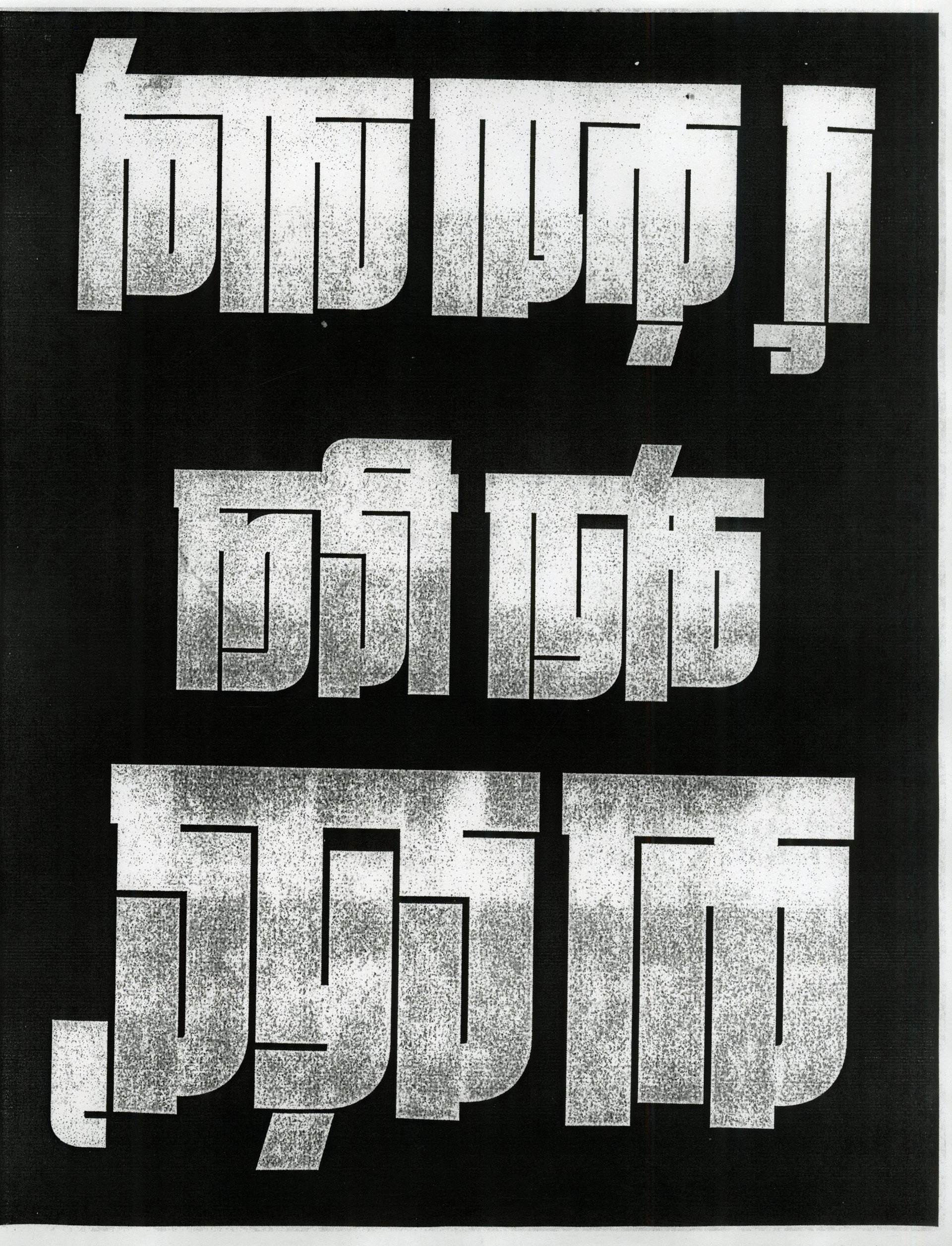
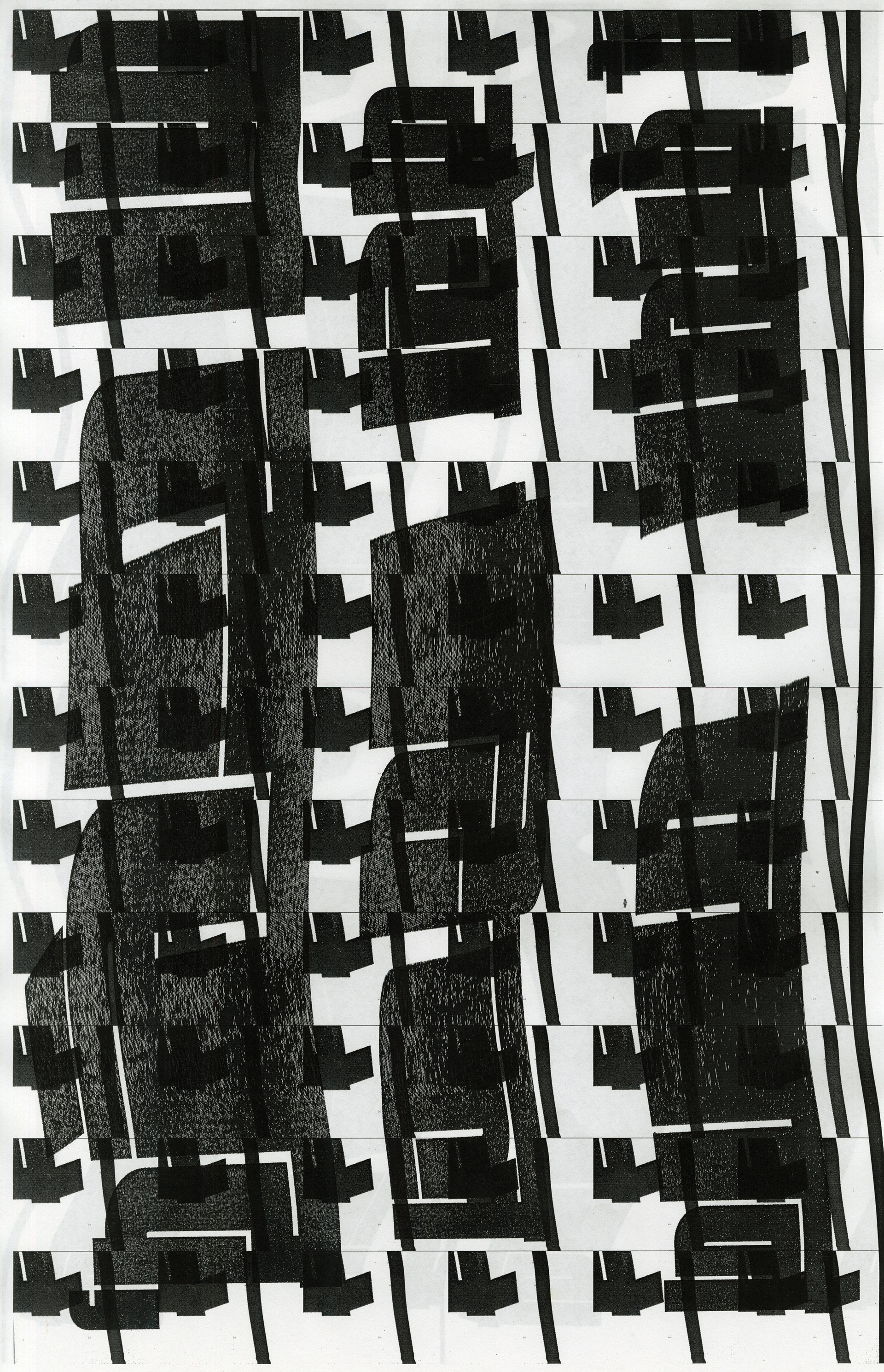
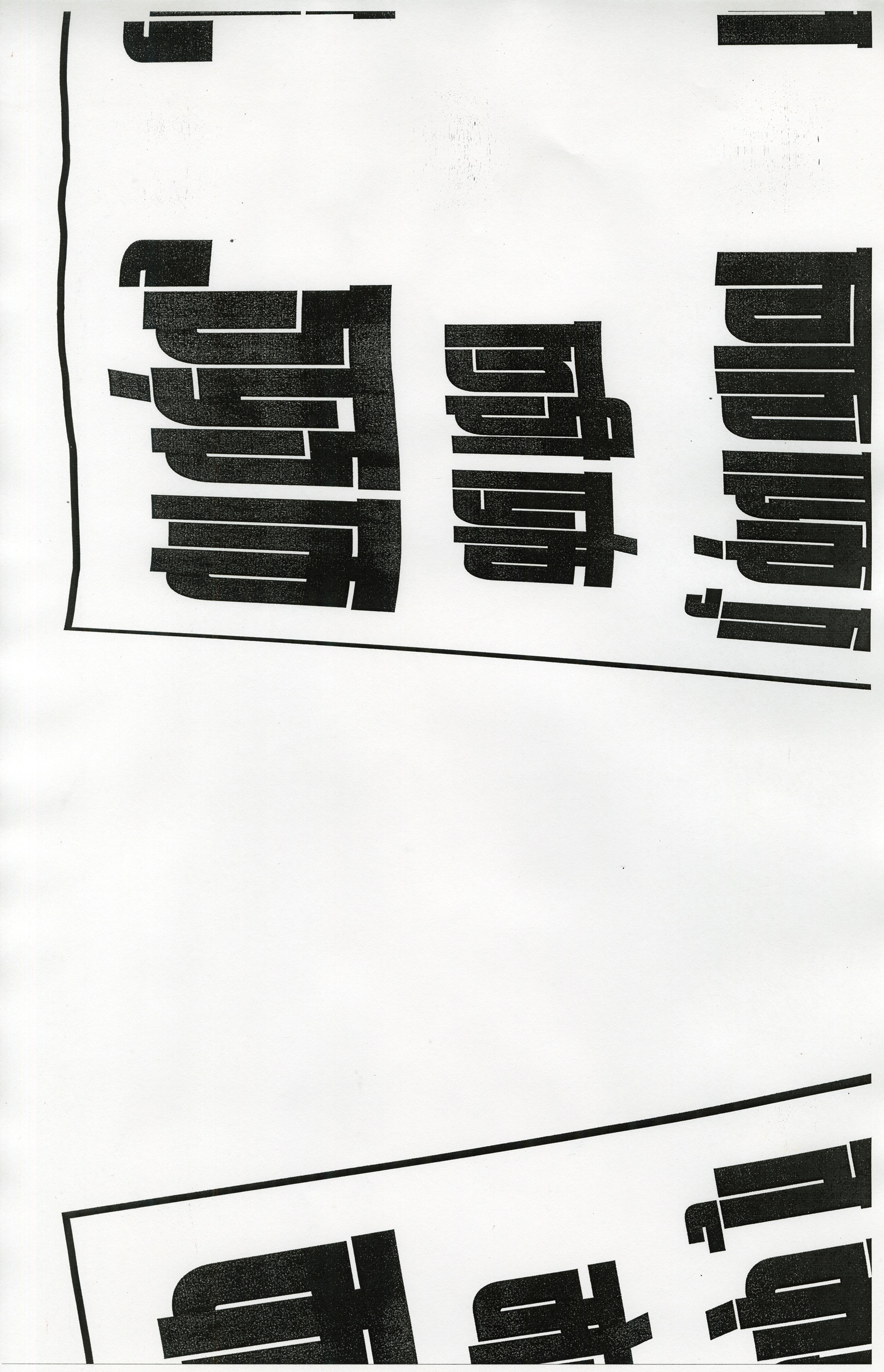
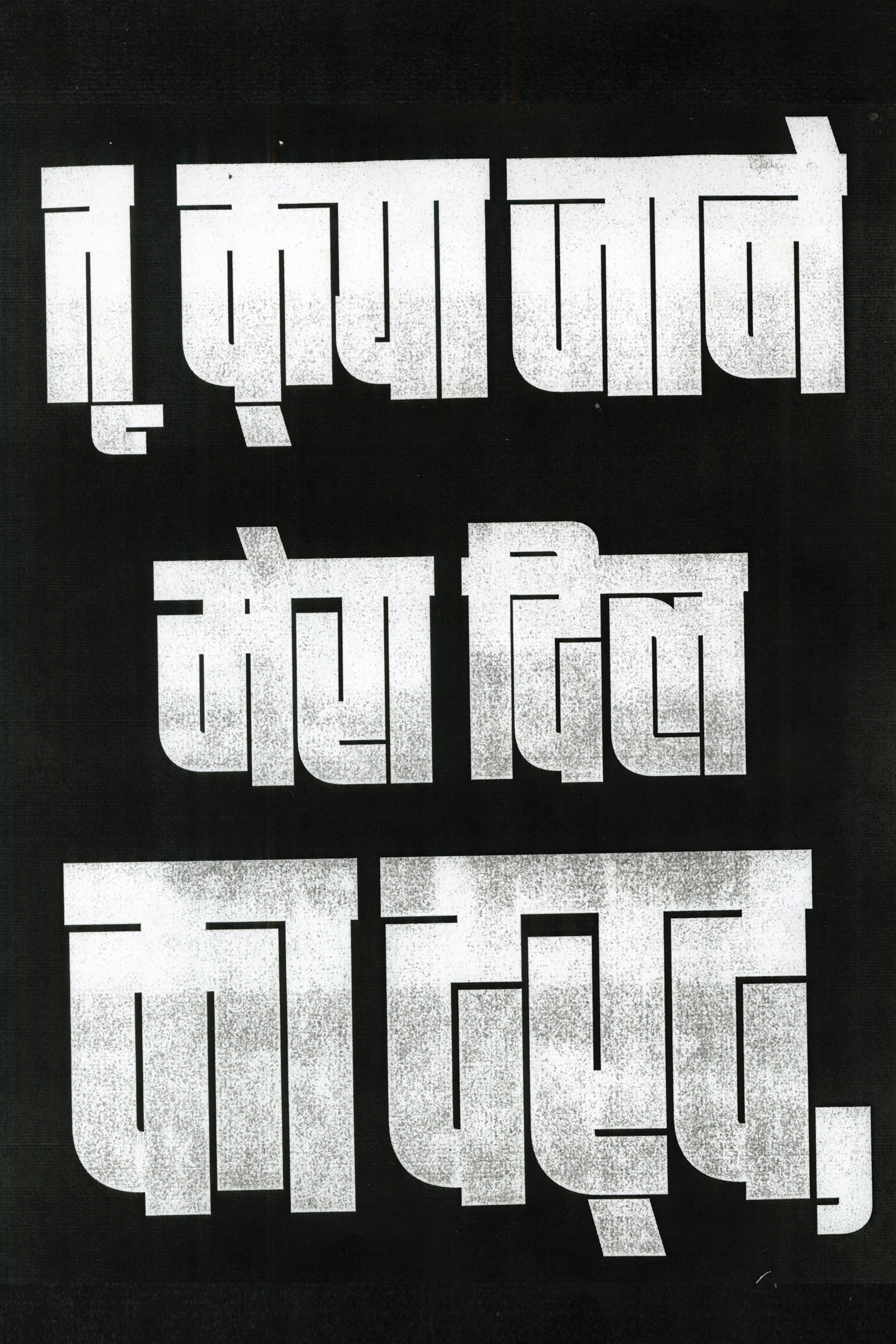
Xerox explorations
Printed slogan, moved it across the scanner bed for varied, unpredictable visual effects, exploring new textures.

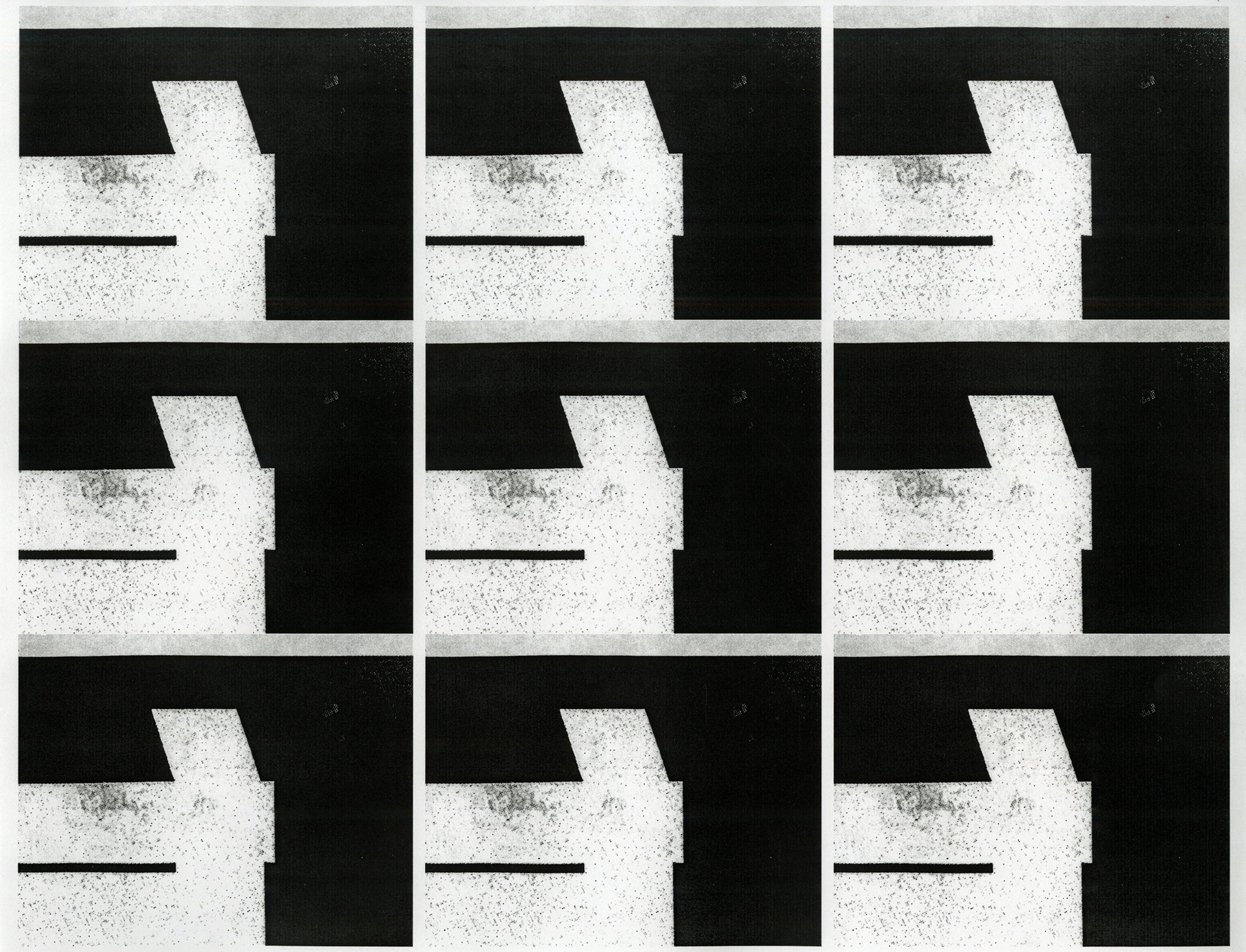
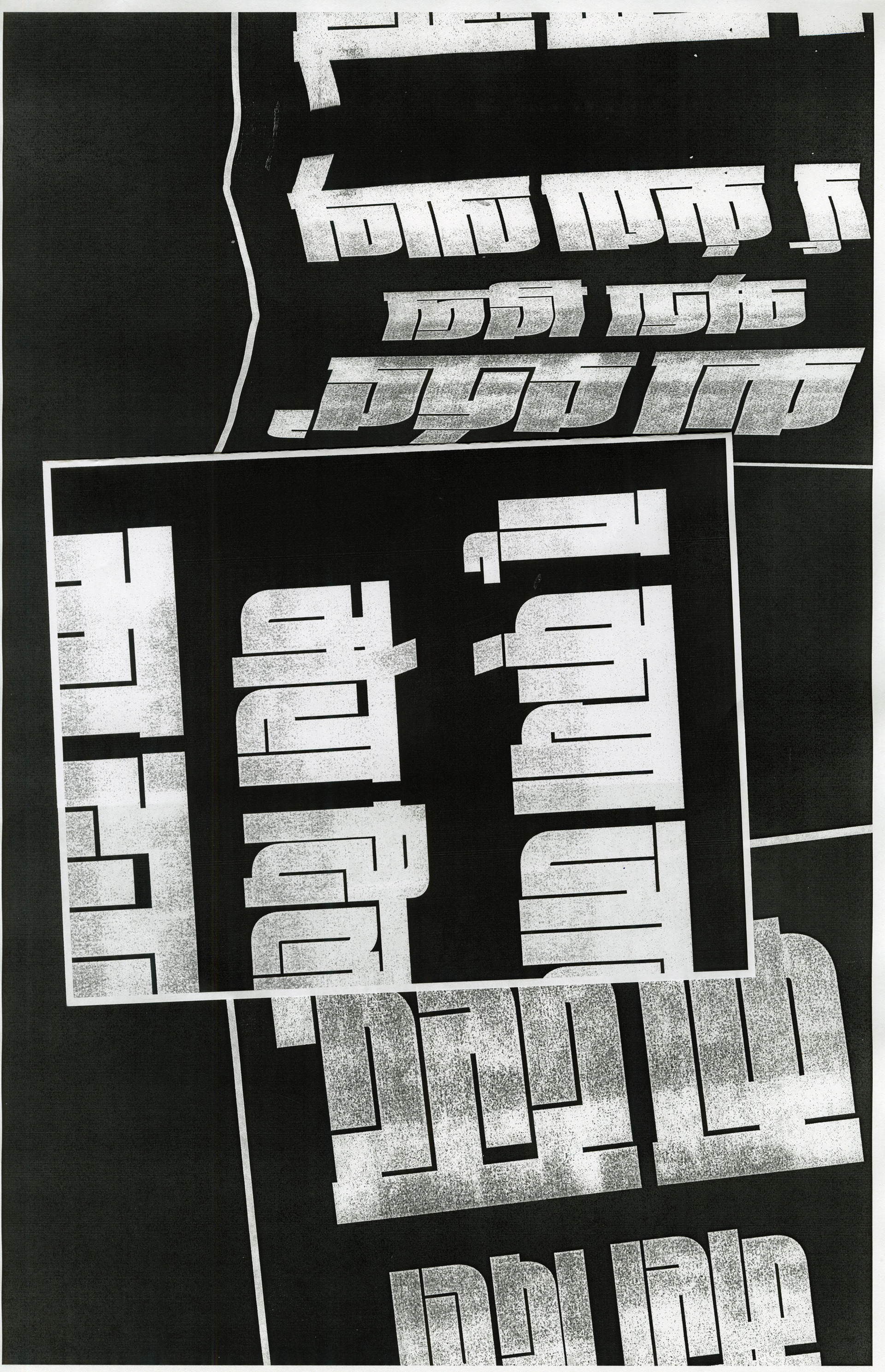
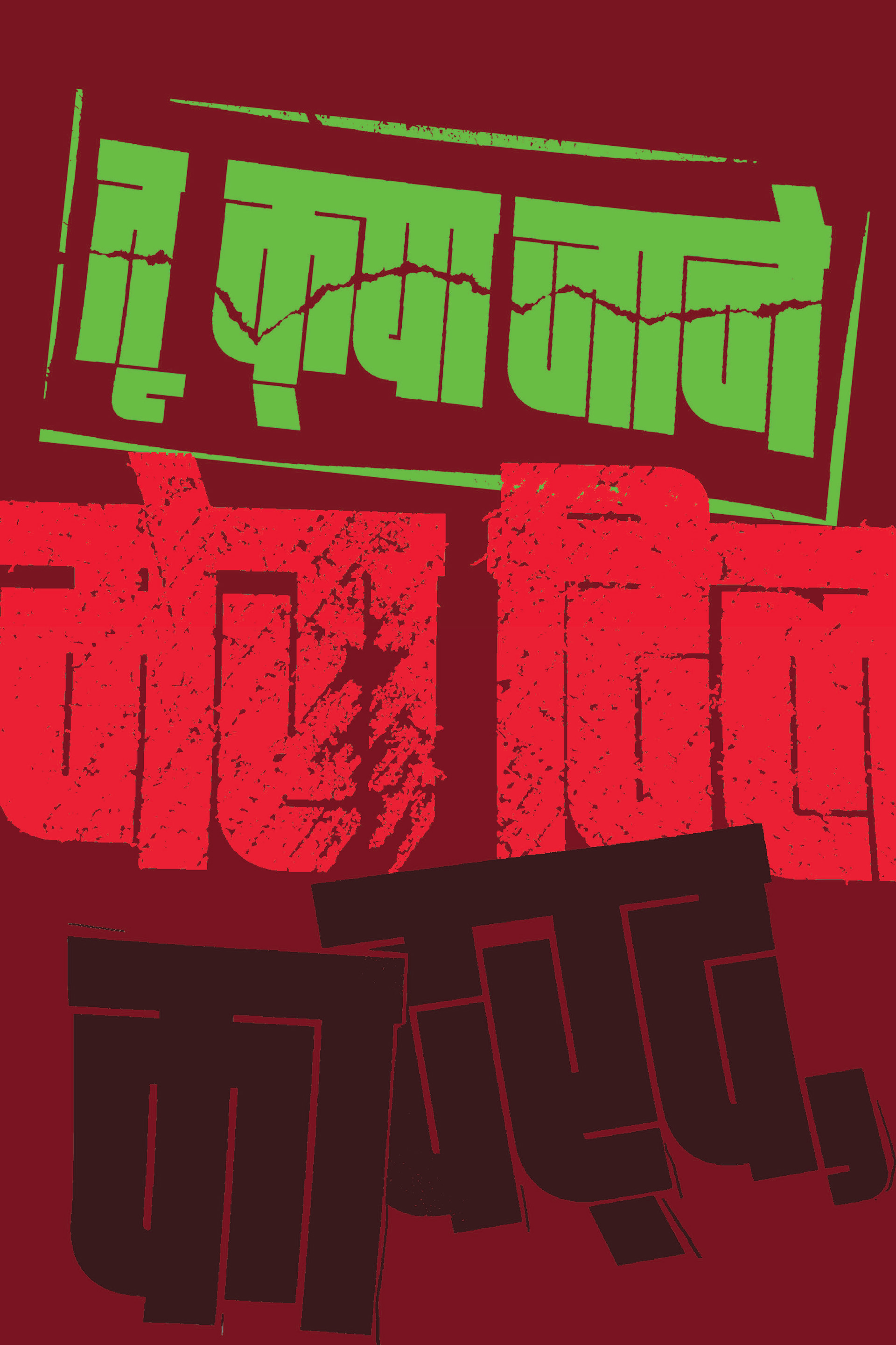
analog explorations
Manipulated the printed slogan physically by tearing, cutting, and overlapping it, creating a raw, tactile texture.


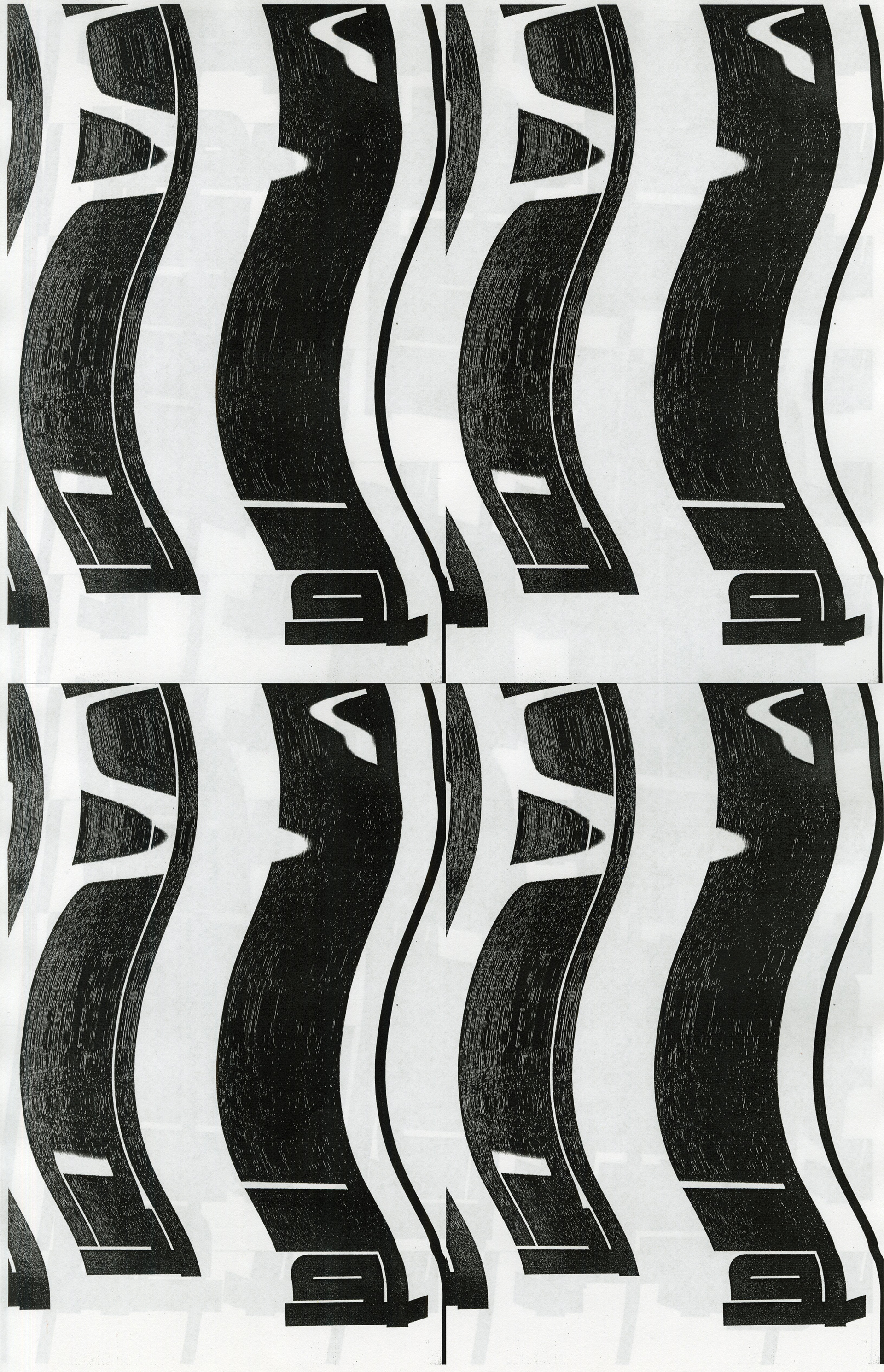
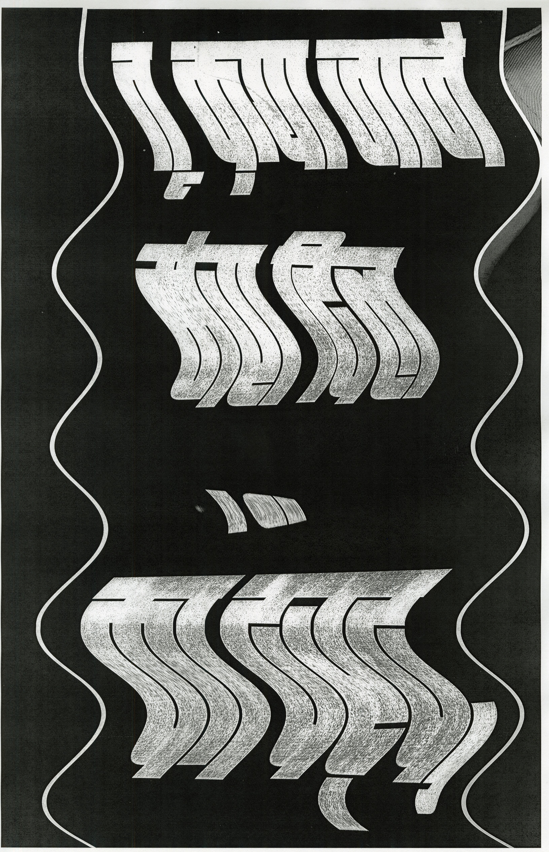
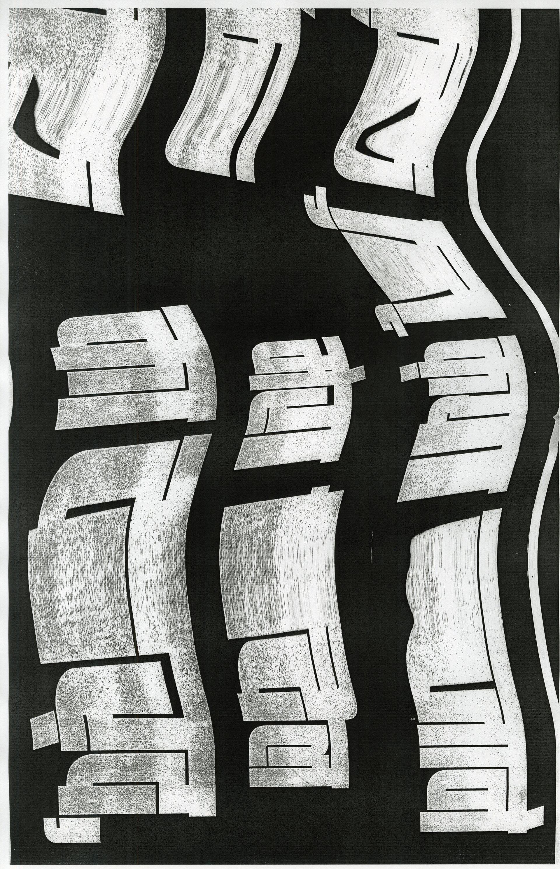
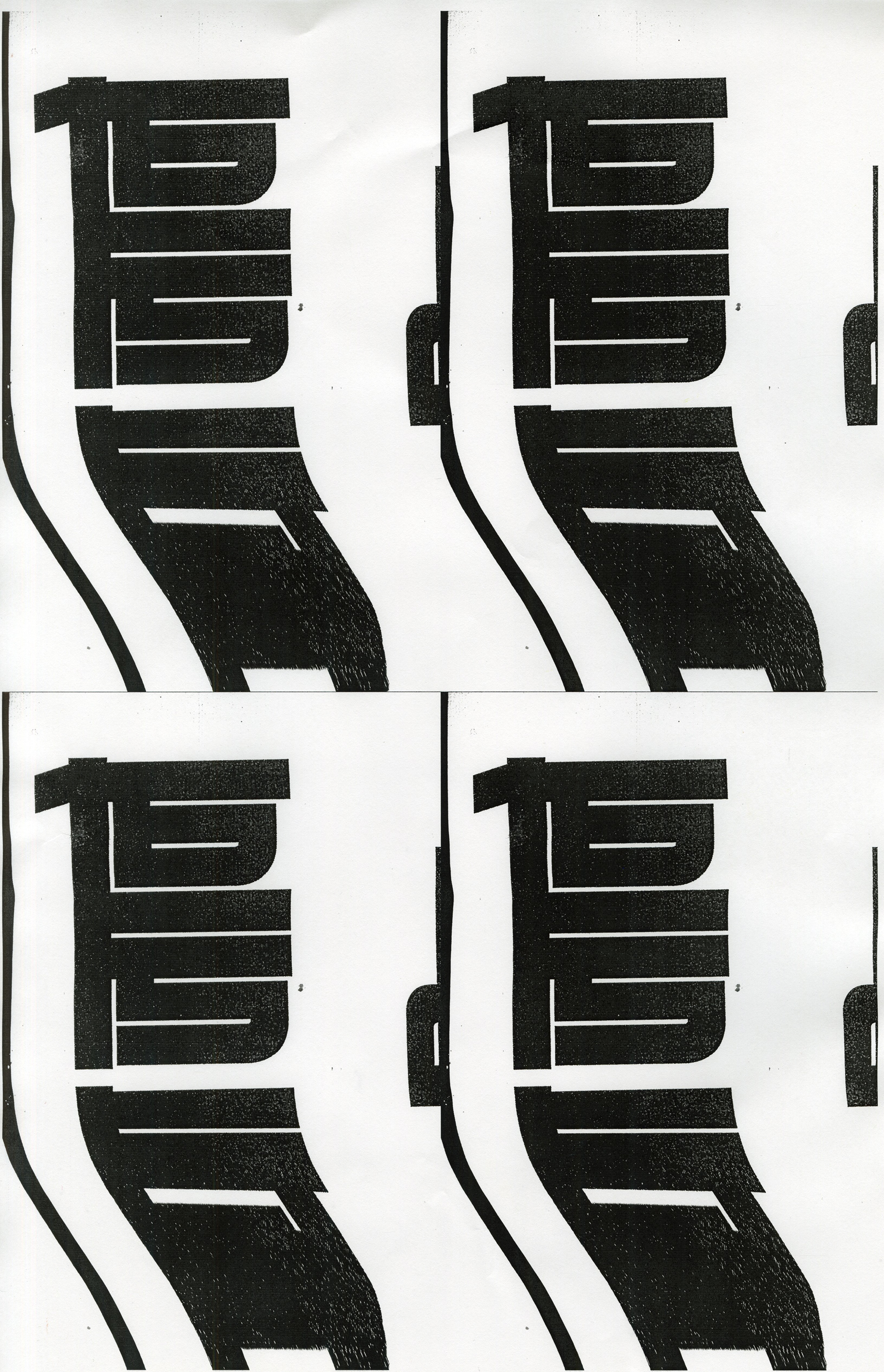
lens explorations
Took photos from various angles to exaggerate the perspective and depth of the text.


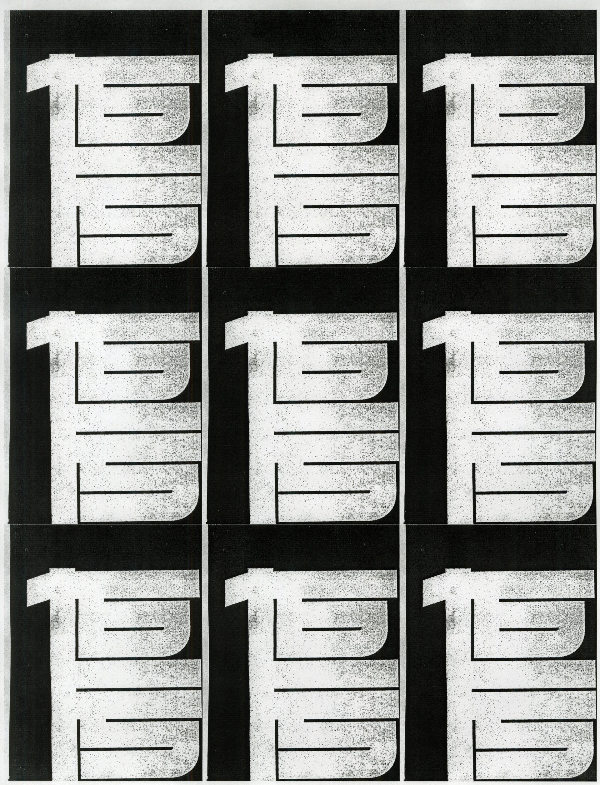
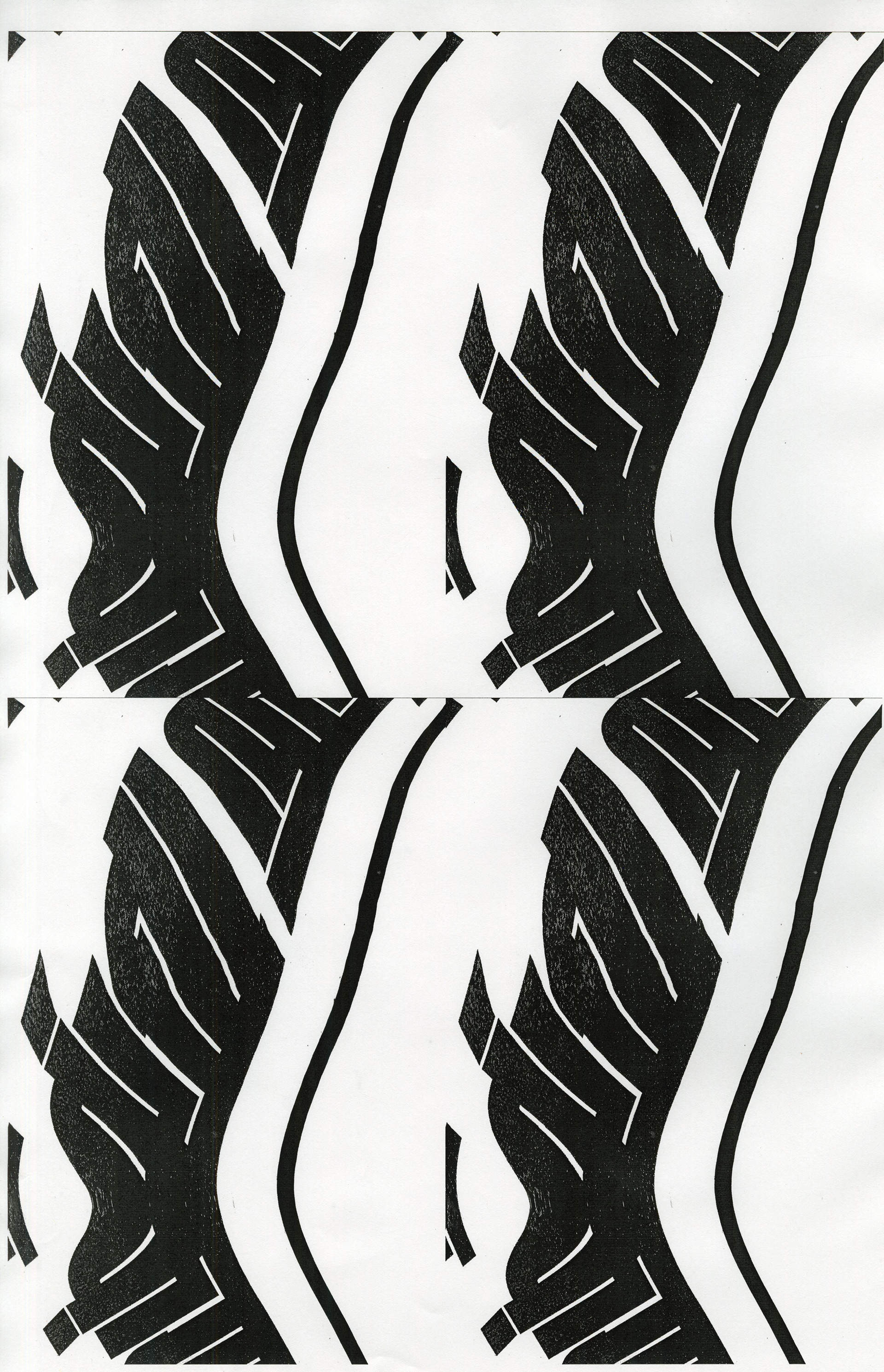
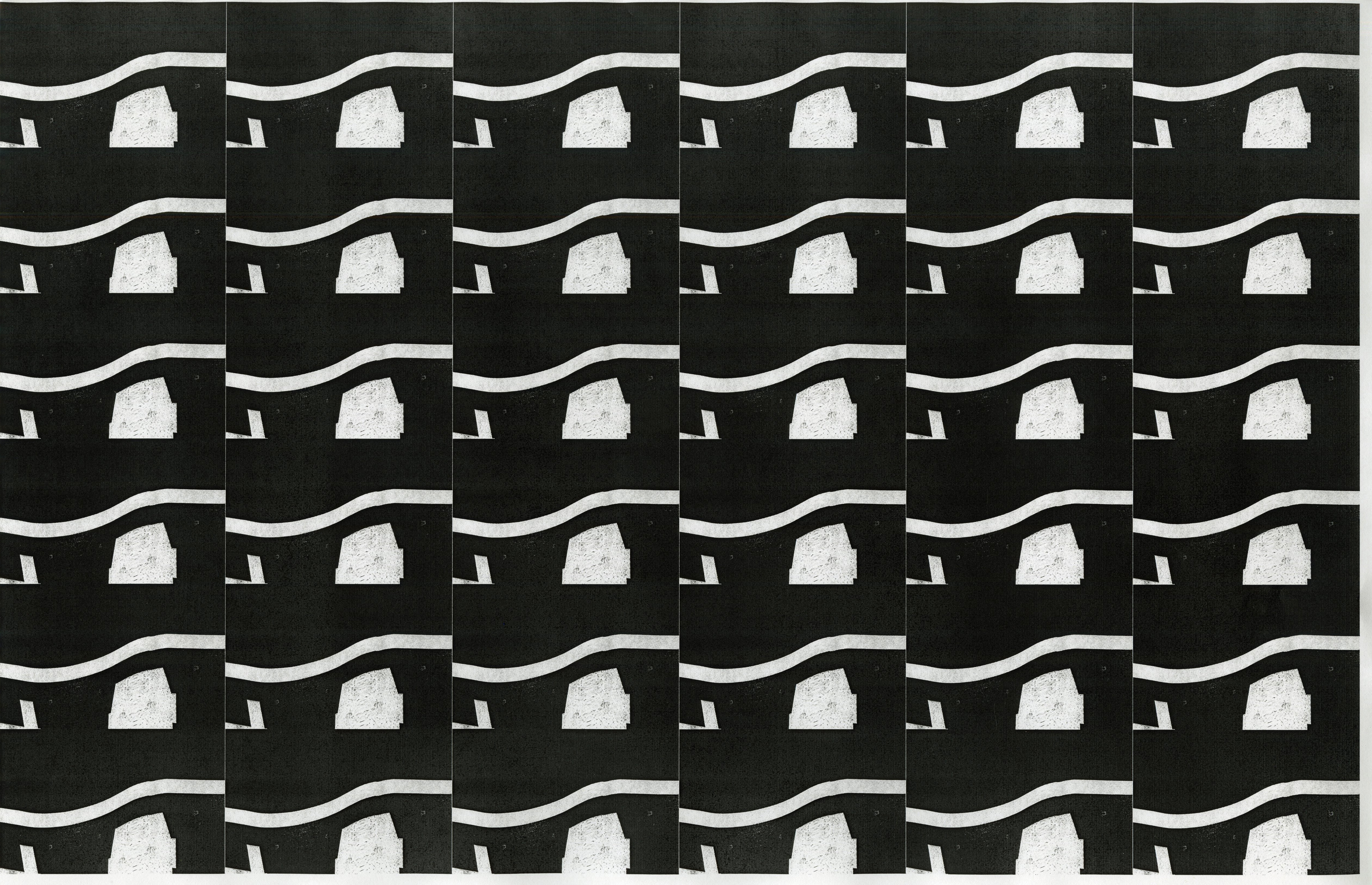
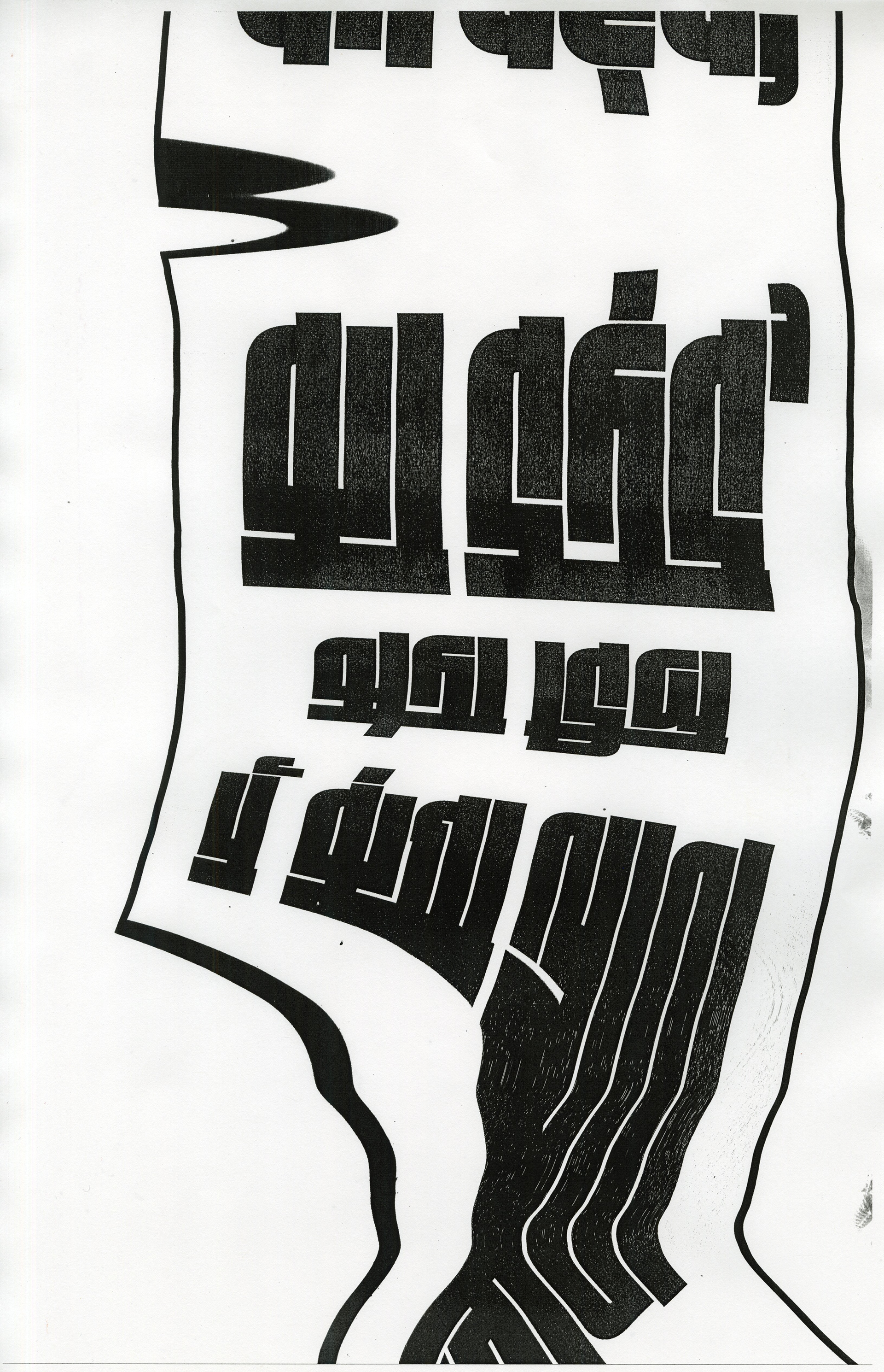
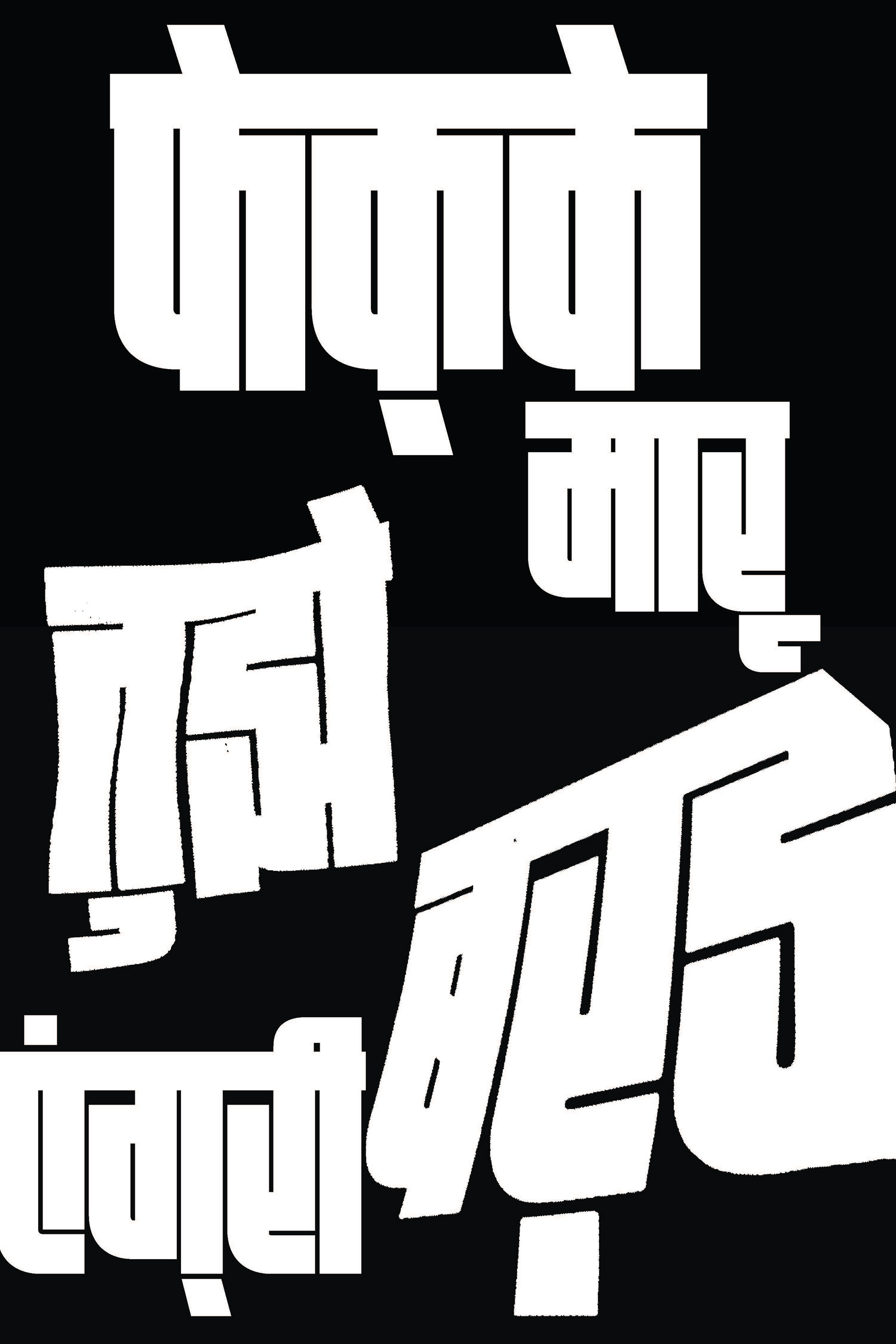
cut paper explorations
Used exacto knives and sharp tools to cut and distress the type, introducing a more sculptural and physical quality to the design.


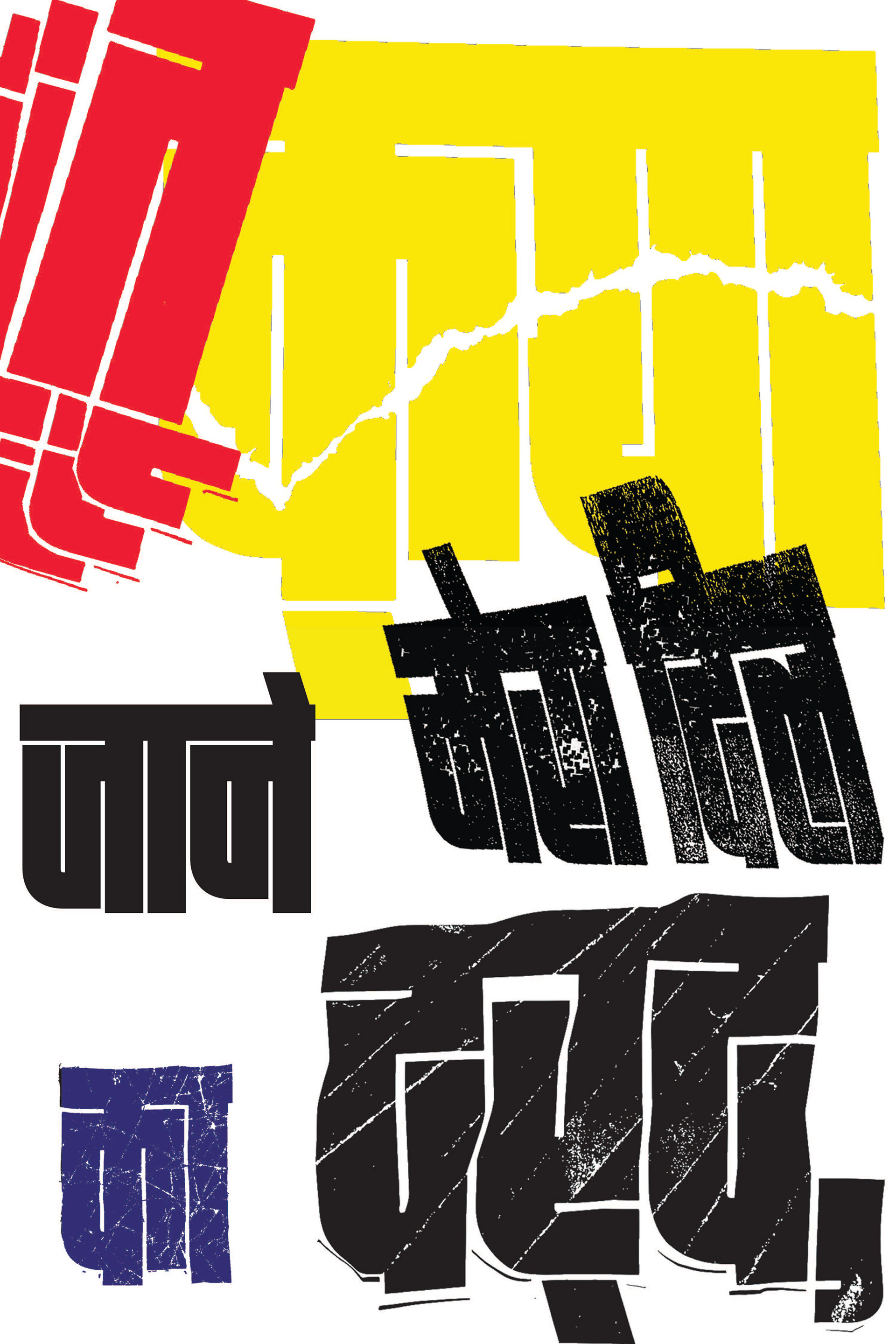
layout explorations
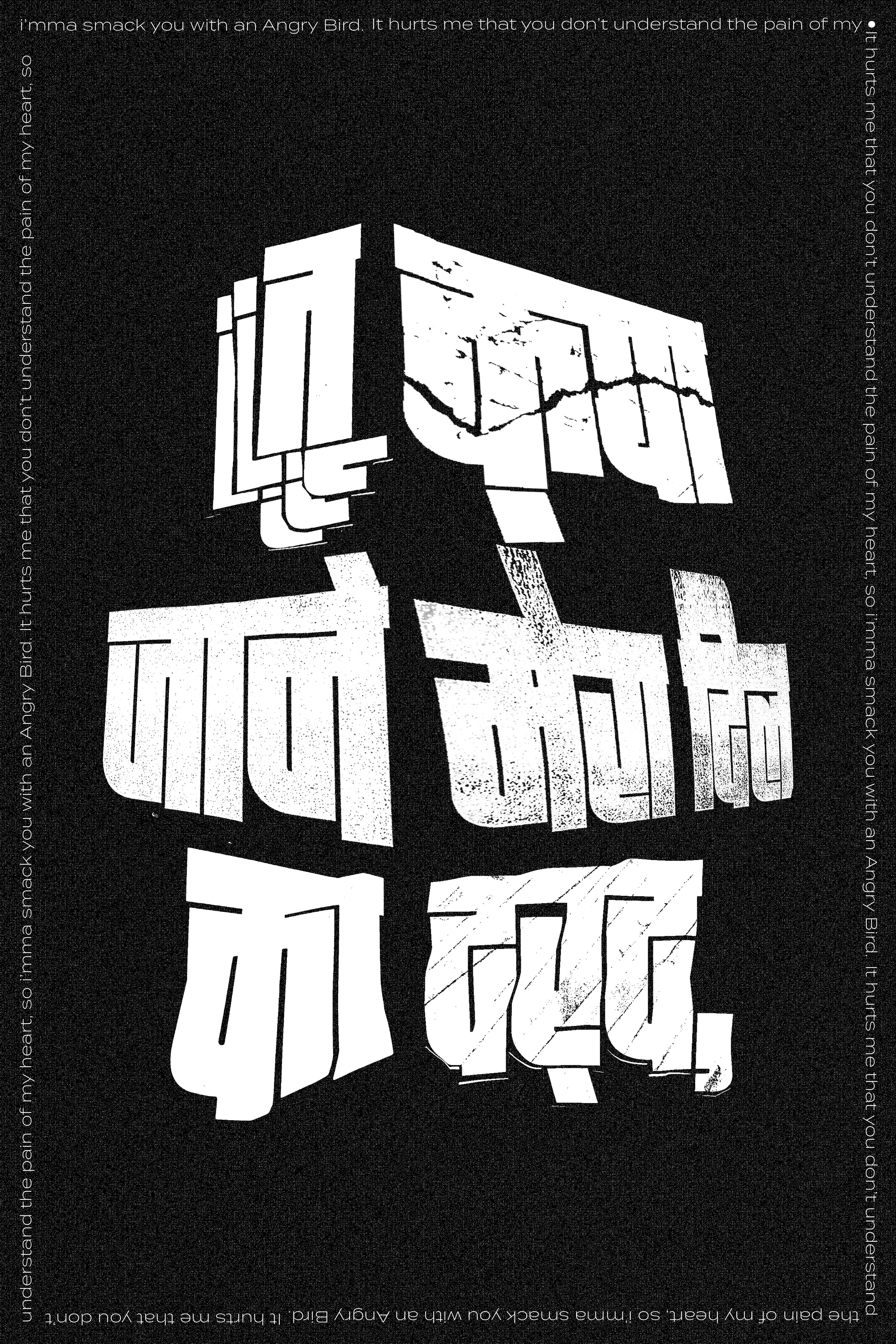
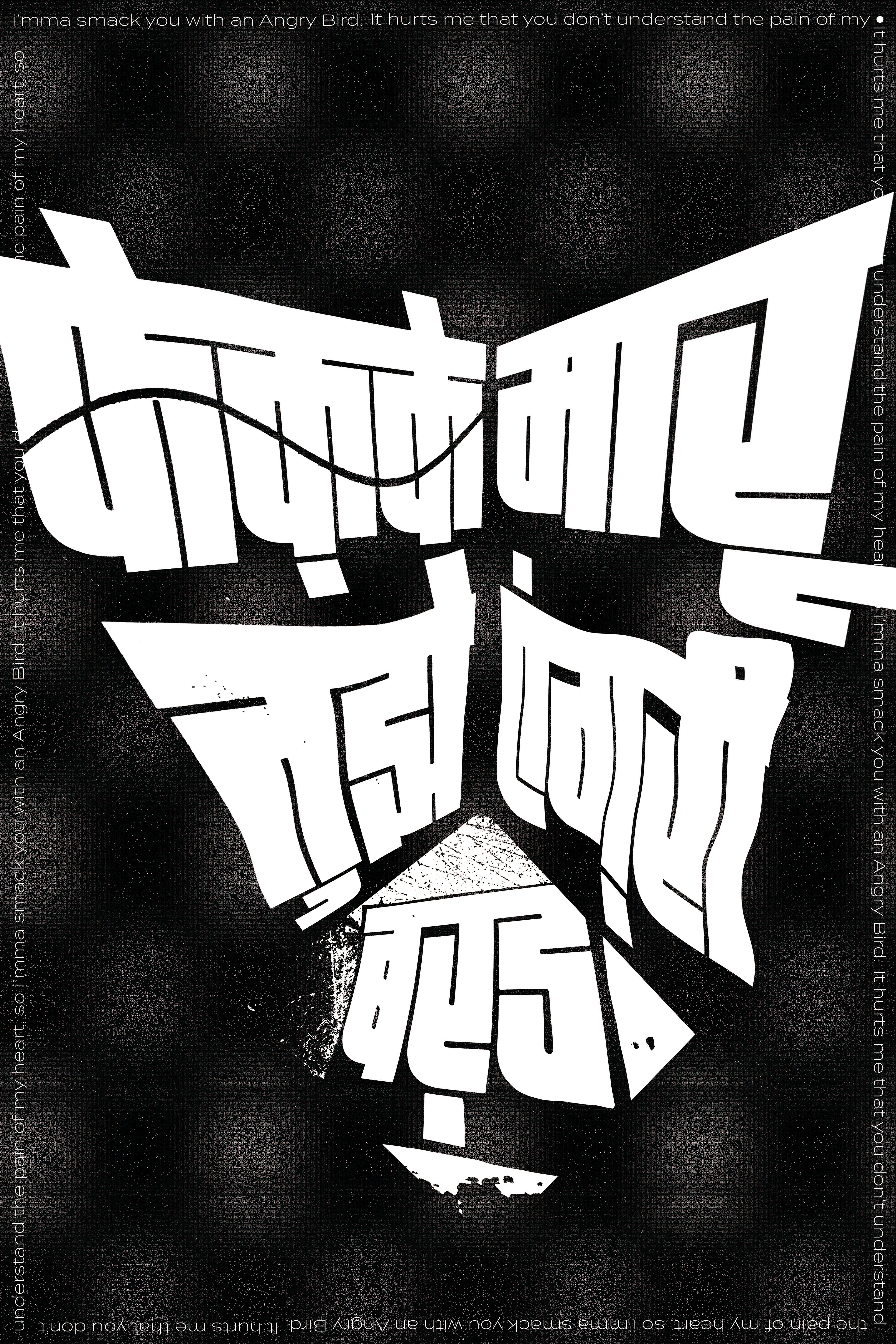
Converted manipulated text into vectors, maintaining texture, and experimented with layouts to create dynamic compositions.
final output
Translated the Hindi text into English for broader audience understanding, integrating it as a complementary element in the final output. The phrase is split into two parts for a two-part series.