initial explorations
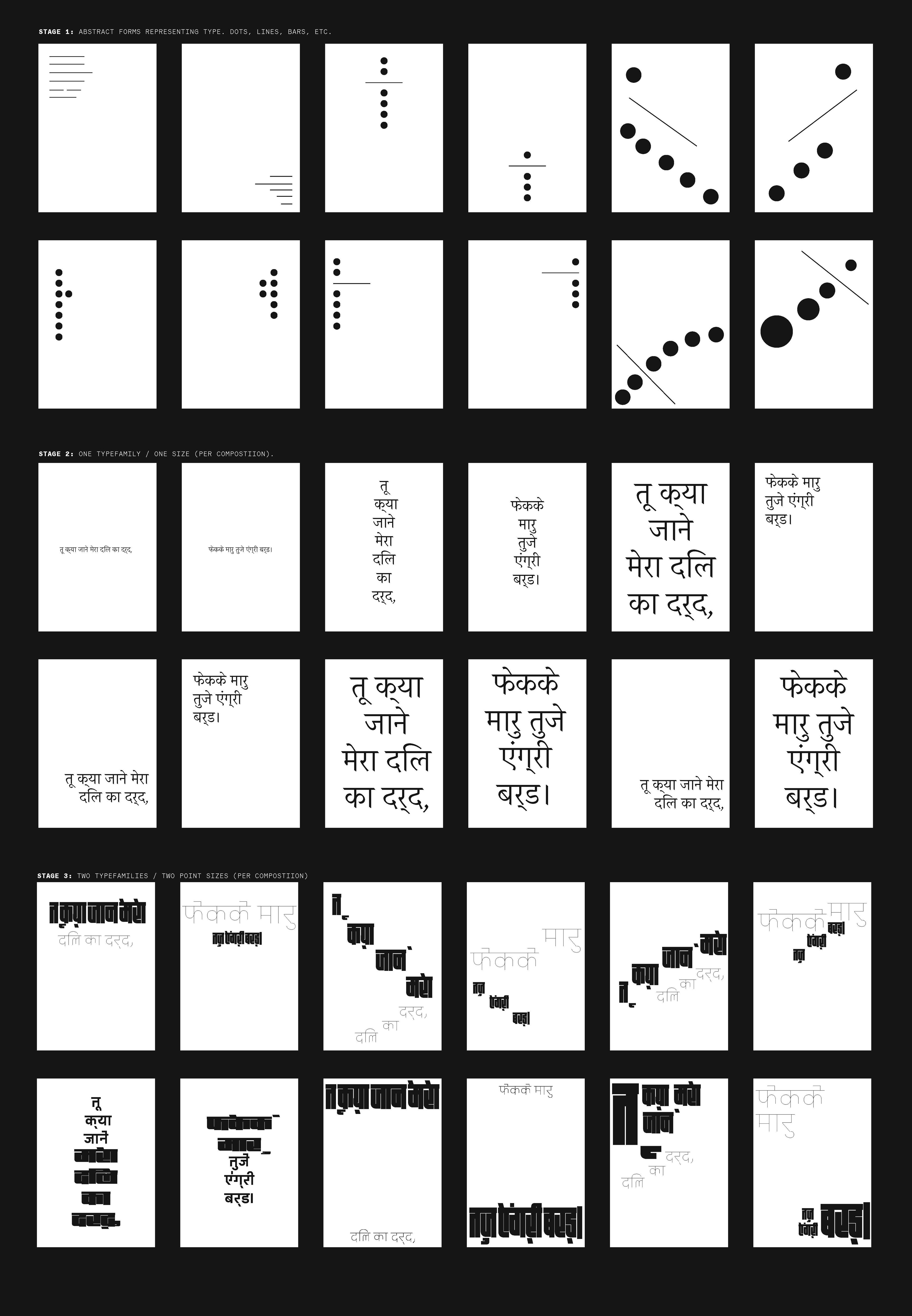
To begin, I started by defining the project’s goal: exploring both the formal and conceptual vocabularies that exist within typography. The idea was to create work with a clear hierarchy and compelling compositional layout. By doing this, I aimed to expand my understanding of the communication potential between the meaning of text and the arrangement and manipulation of typography itself. To push this concept further, I also integrated analog methods and techniques into my design process, which was something I had not explored much before.
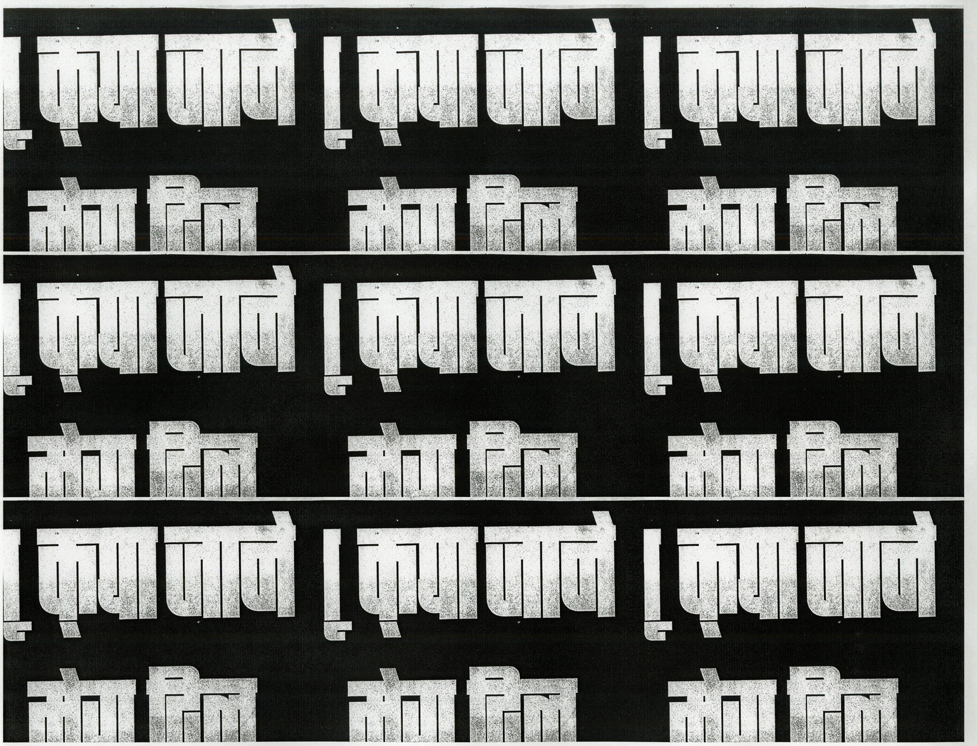
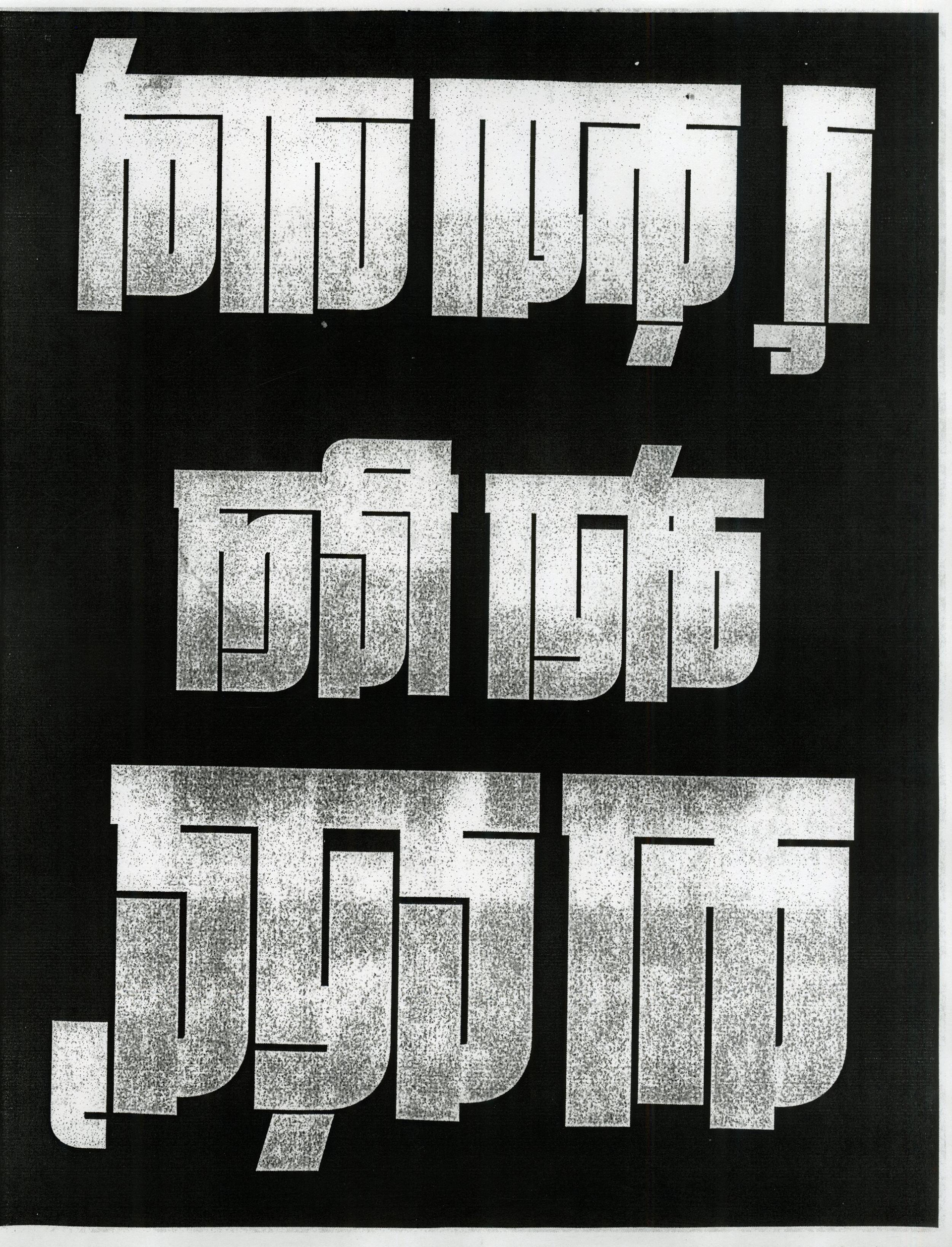
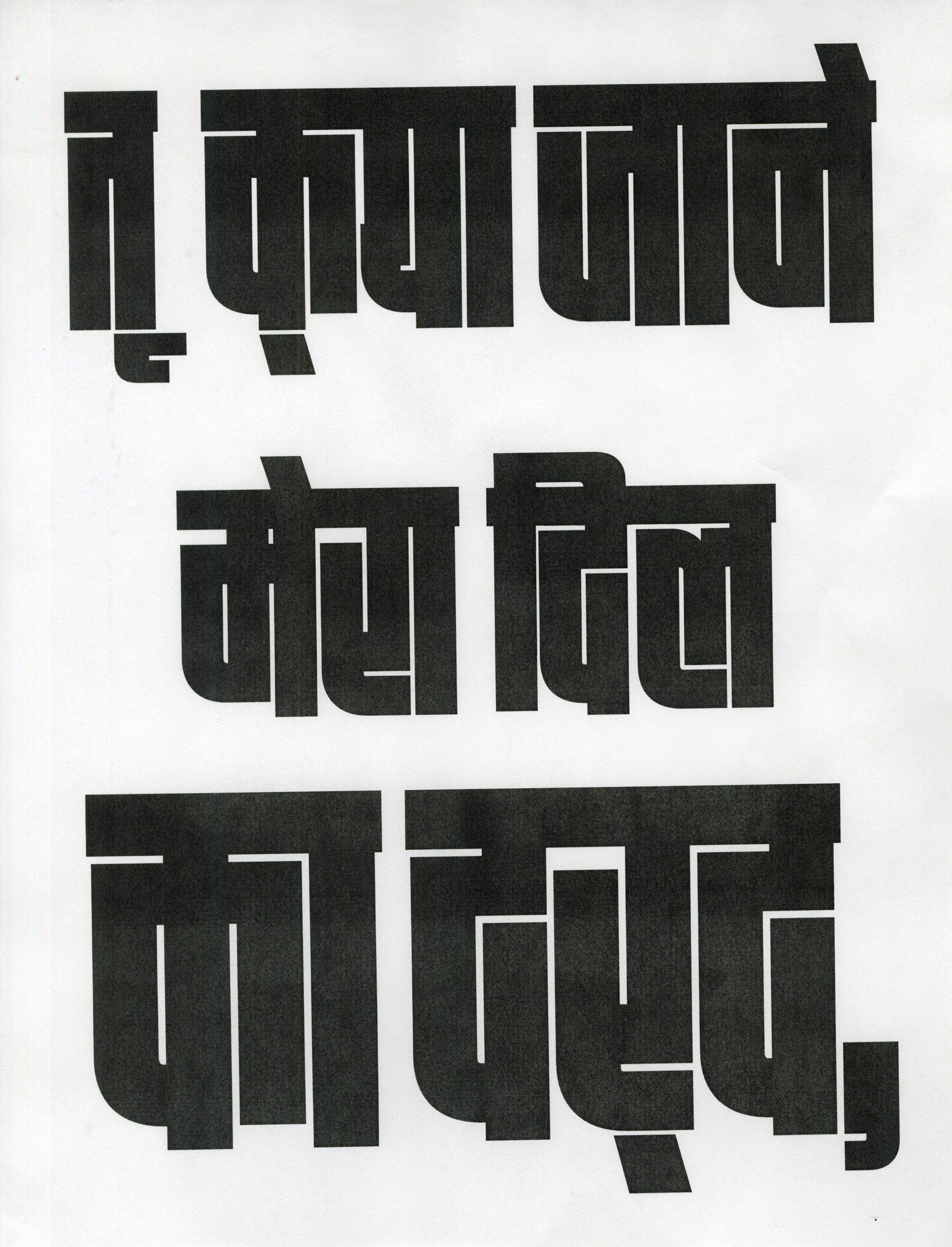
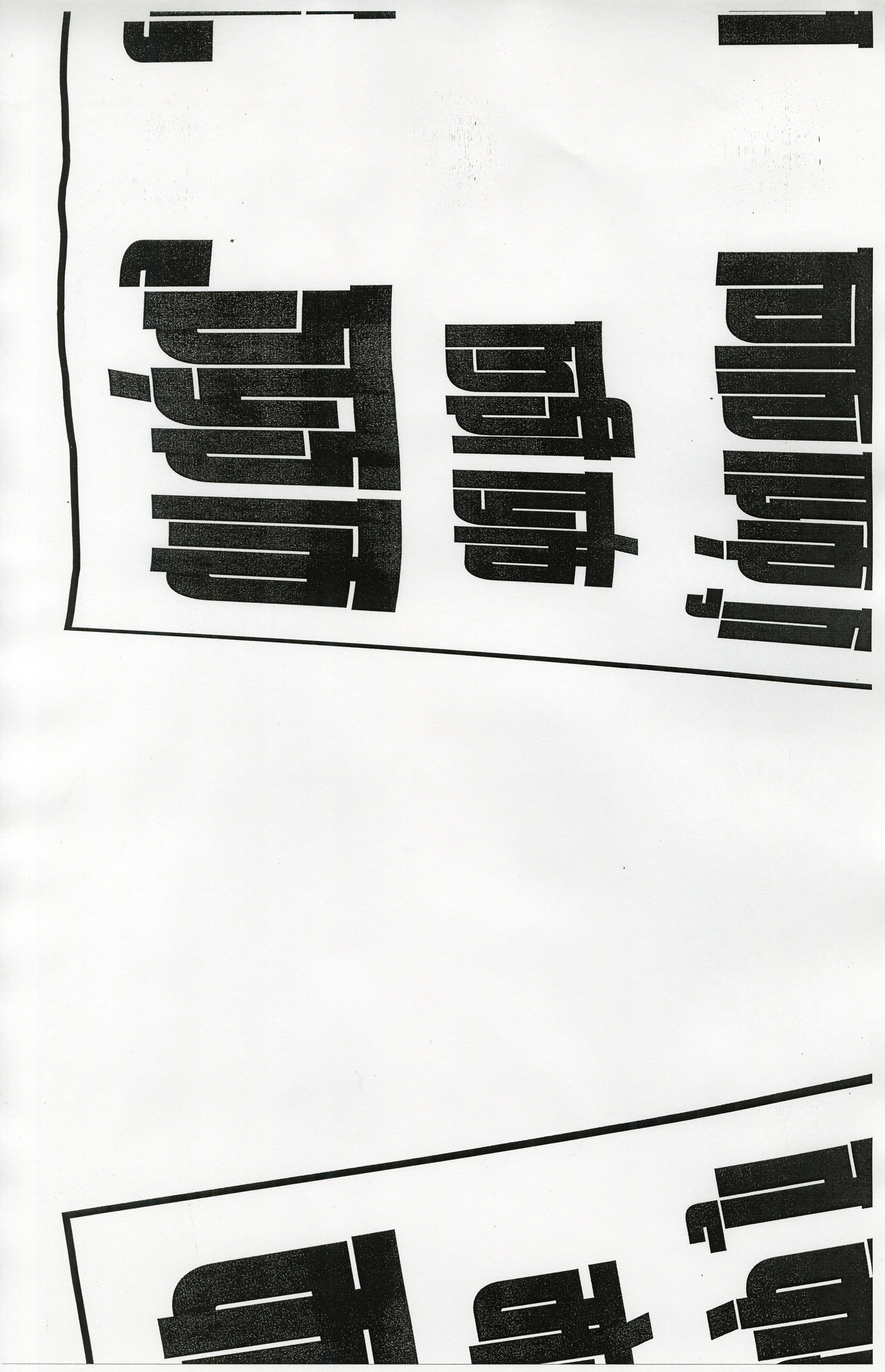
At this stage, I hadn’t worked with the Hindi language in a graphic design context, so I needed to conduct research to ensure that the changes I was making to the text didn't interfere with its readability. This was especially important because I wanted to respect the essence of the language while still experimenting with design. I spent time exploring Hindi typography in various contexts and studying its flow, letterforms, and intricacies. This helped me avoid taking the modifications too far, maintaining readability while experimenting with its design.
Xerox explorations
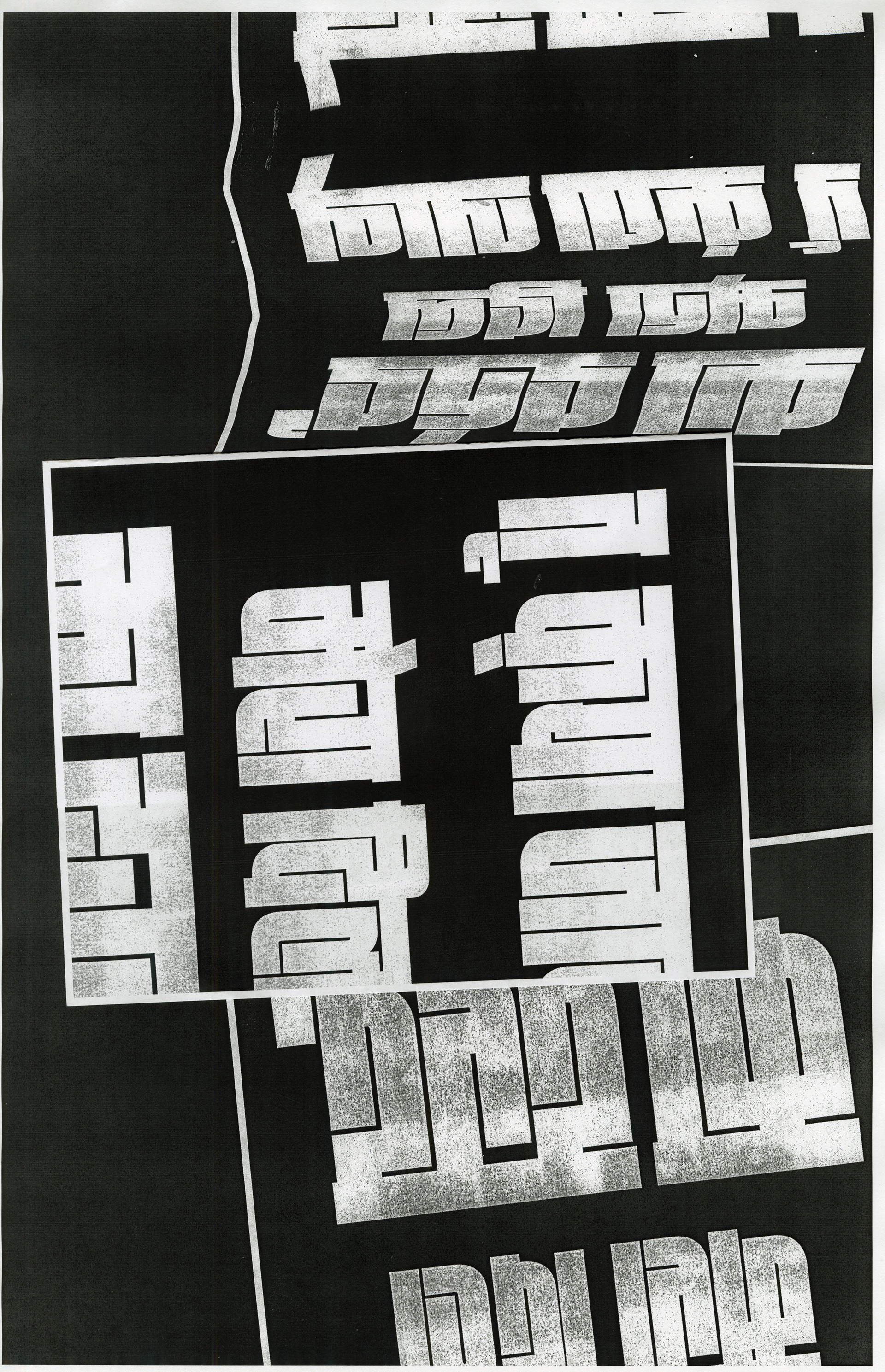
Next, I dived into an experimental phase using Xerox machines. I printed out my slogan and moved it across the scanner bed to achieve different visual effects. This step was all about pushing the boundaries of how text could appear when subjected to distortion, layering, and unpredictable results. The varying textures and overlaps created an entirely new dimension for the text, sparking further exploration into alternative methods of manipulation.
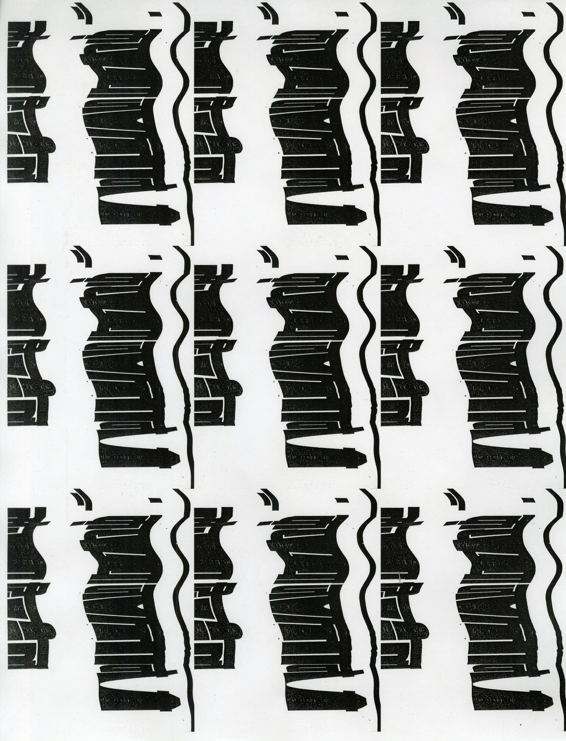
analog explorations


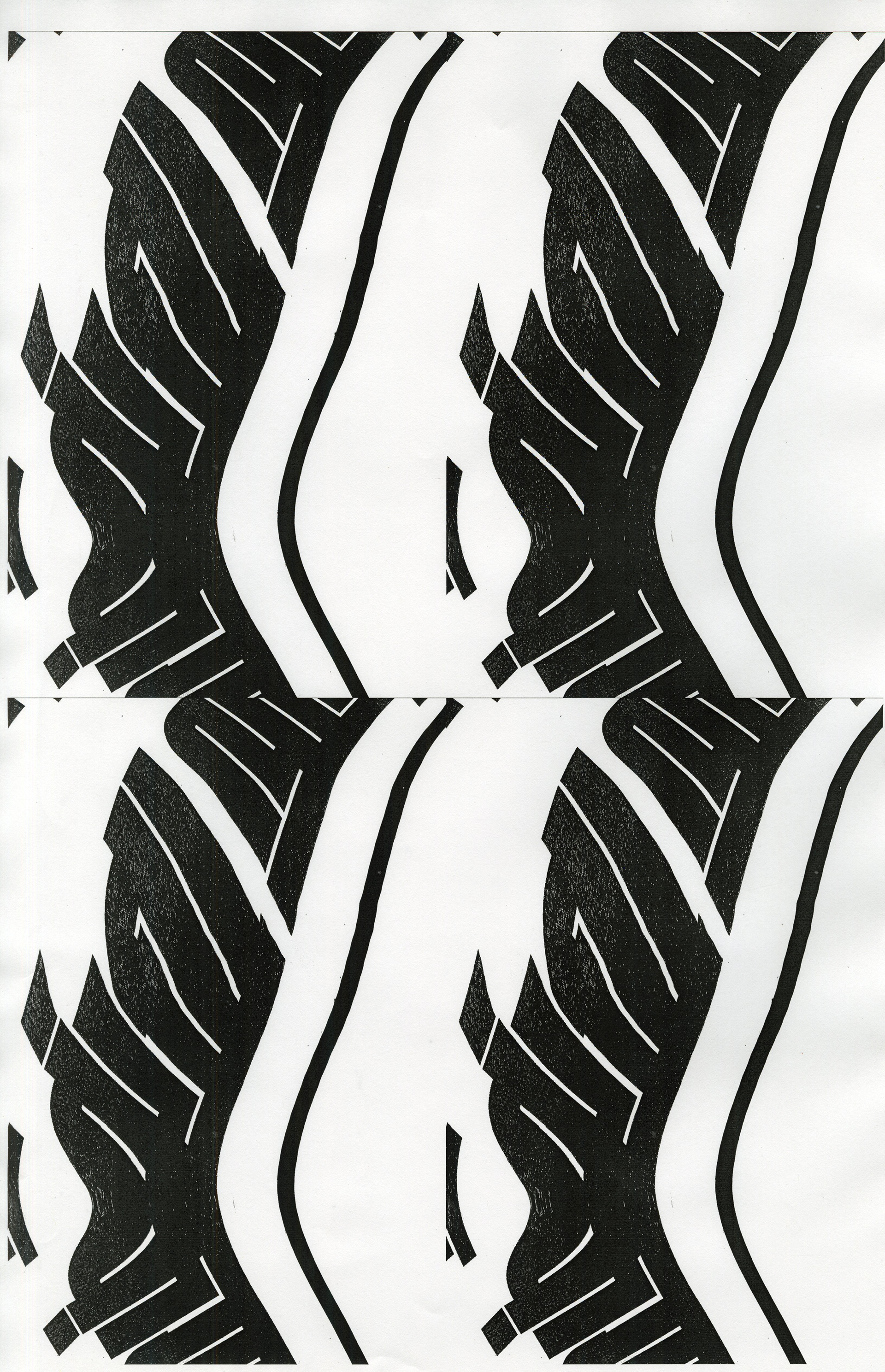
From there, I moved on to more tactile, hands-on experiments. I took the printed slogan and manually manipulated it by tearing, overlapping, cutting, and sticking it in different configurations. I even crushed the paper to distort the text further, emphasizing an organic, imperfect nature that added a layer of emotion to the typography. These analog explorations helped to imbue the type with a sense of rawness and texture, deviating from purely digital designs.
lens explorations
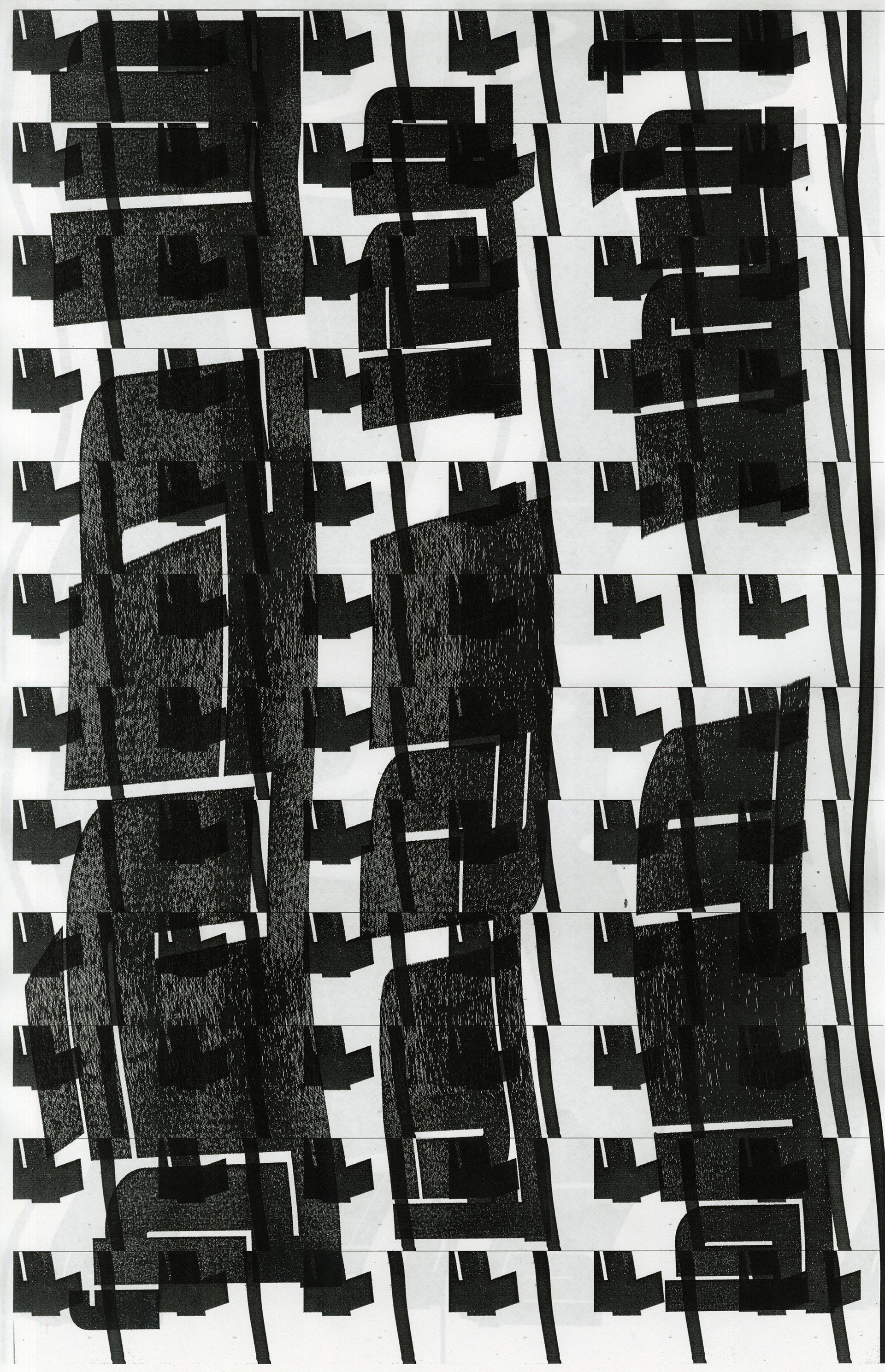
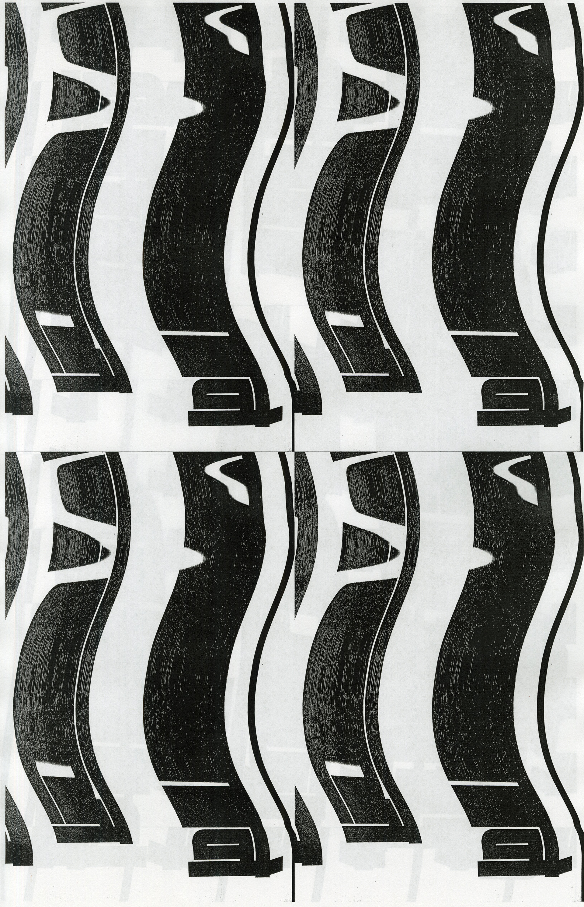
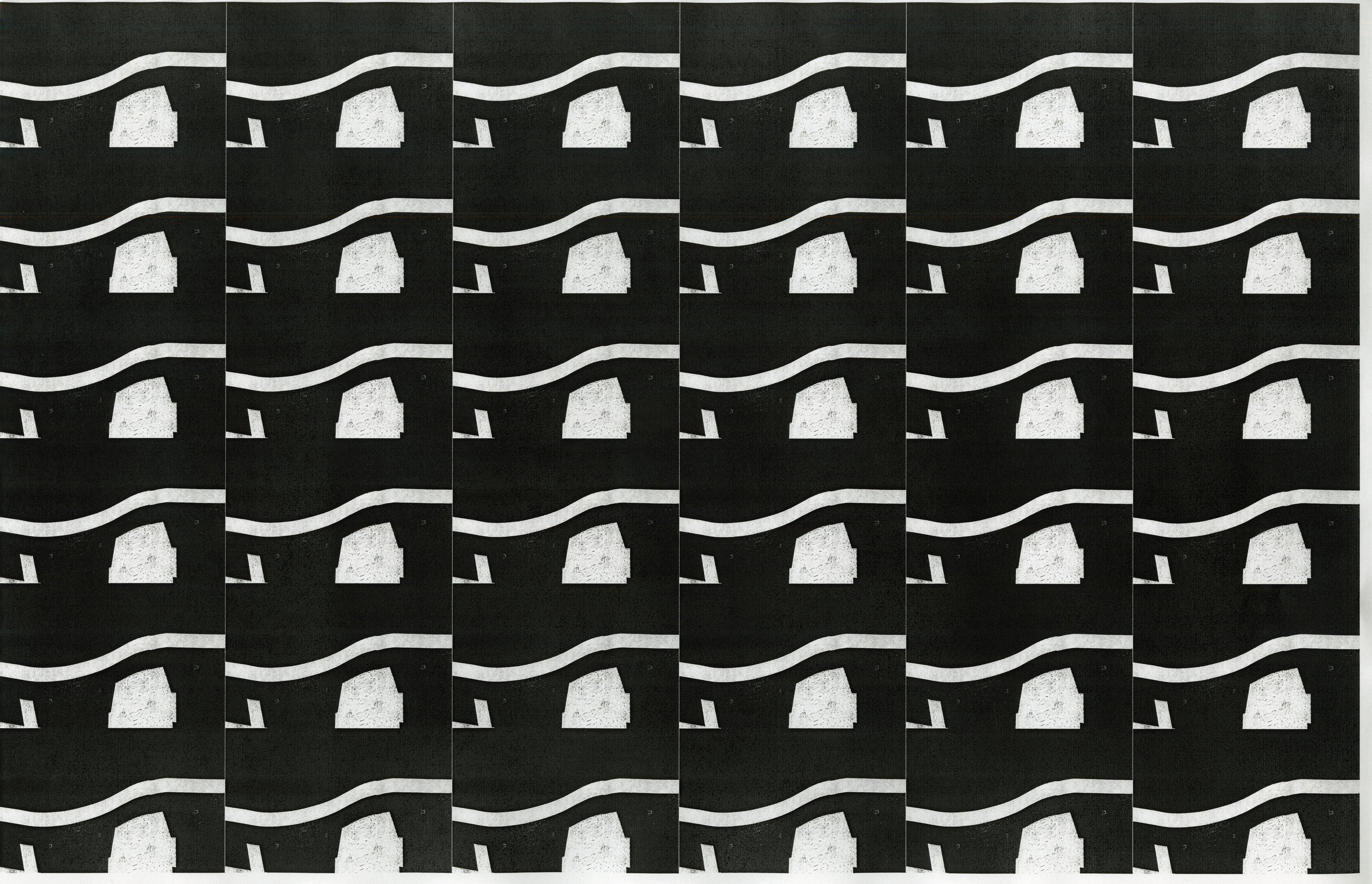
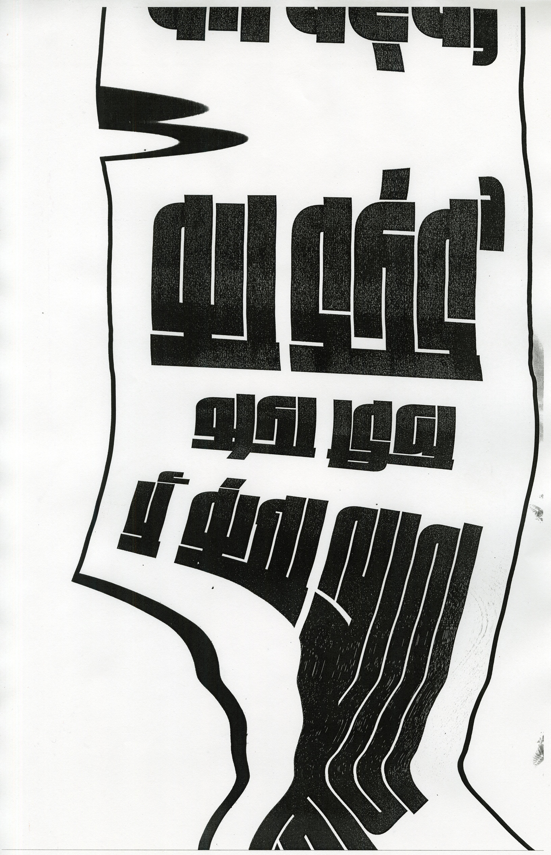
I wanted to capture the text from different perspectives to give it an exaggerated and dynamic feel. For this, I used a camera to take photographs of the type from various angles. This step introduced a sense of movement and depth to the project, highlighting how lens distortion can affect the perception of type. It was important for me to find a balance between abstraction and legibility.


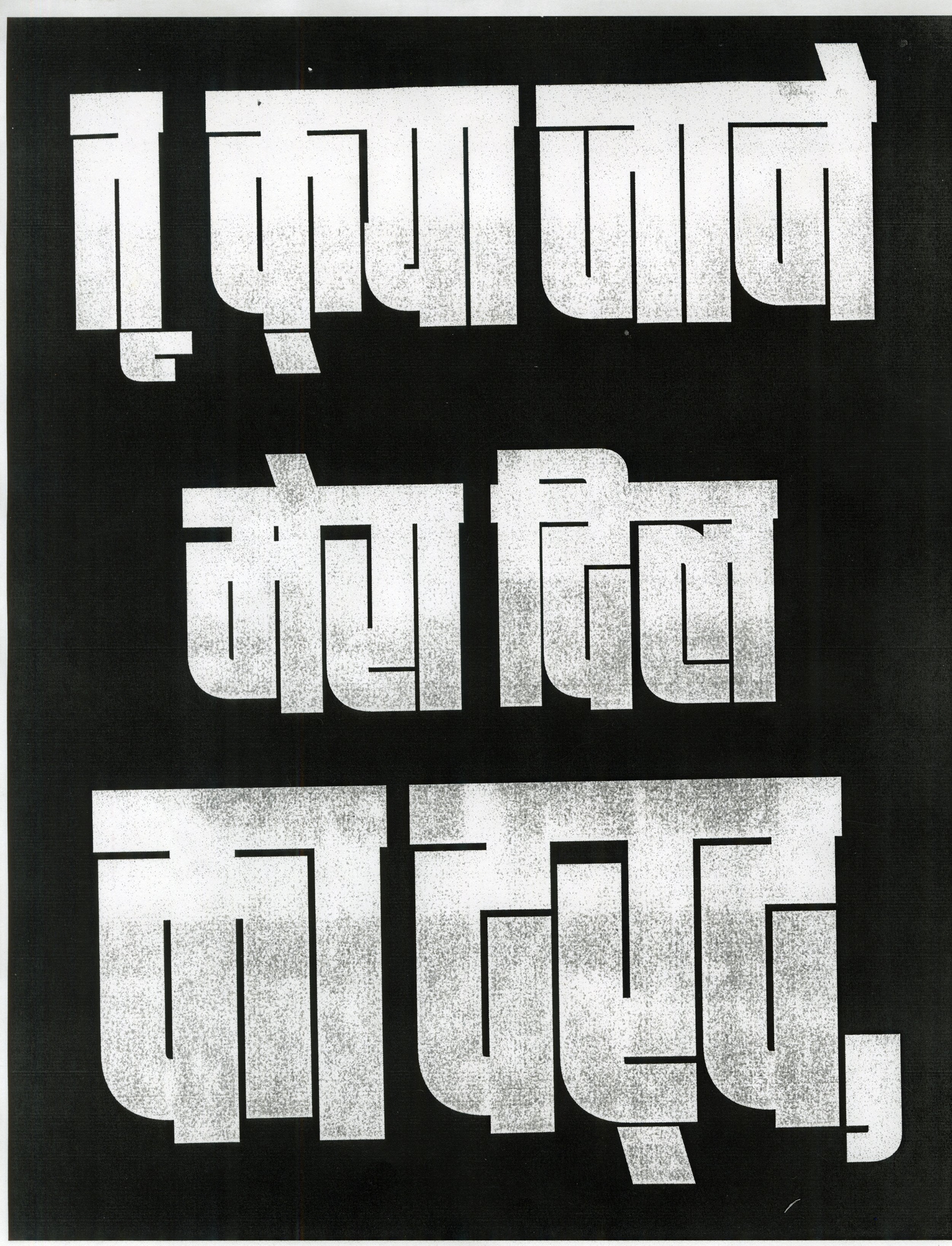
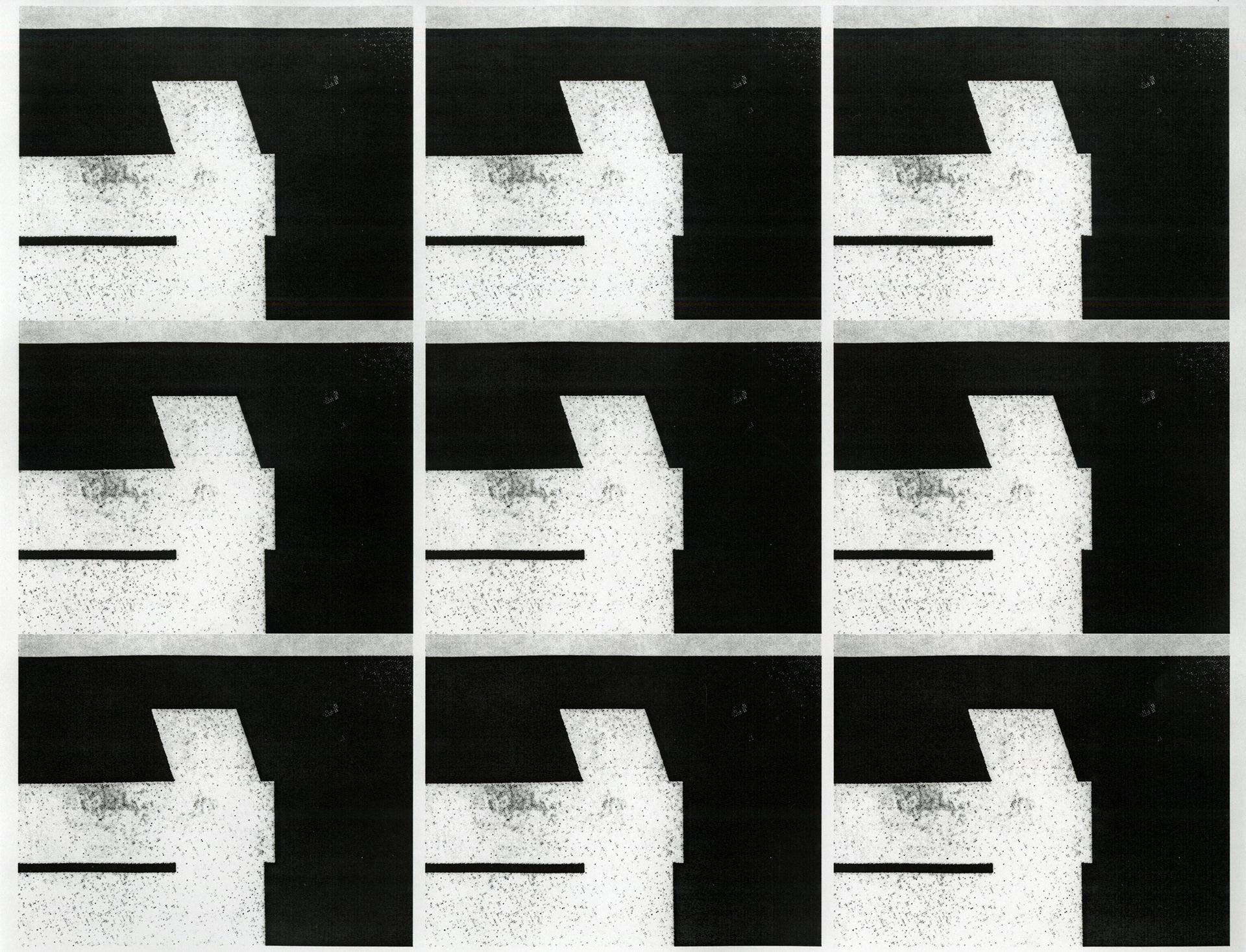
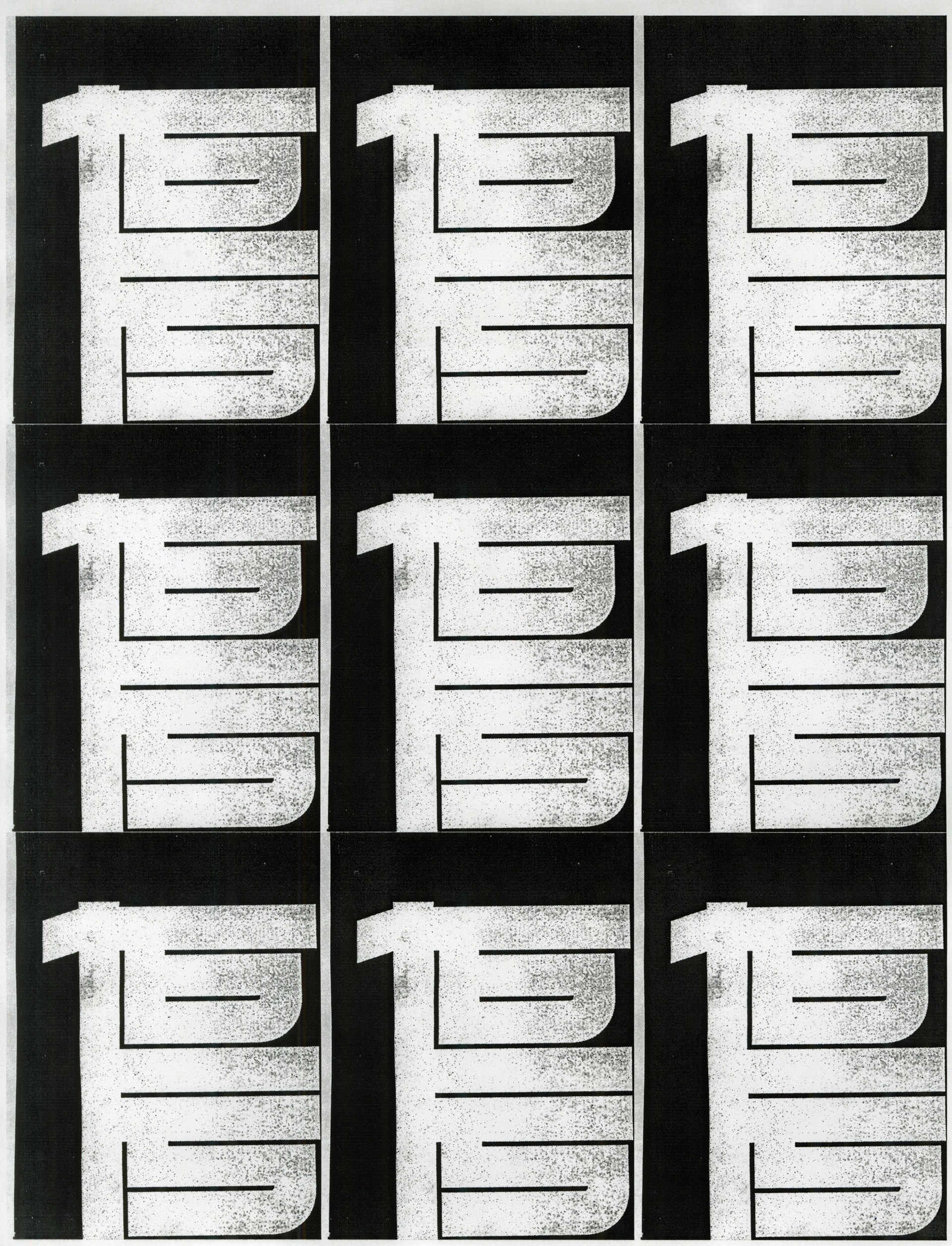
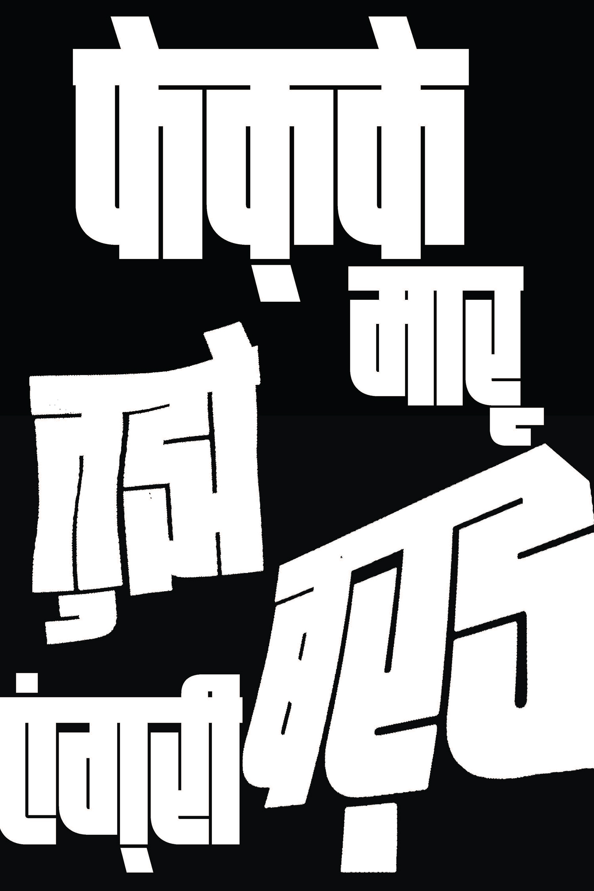
cut paper explorations


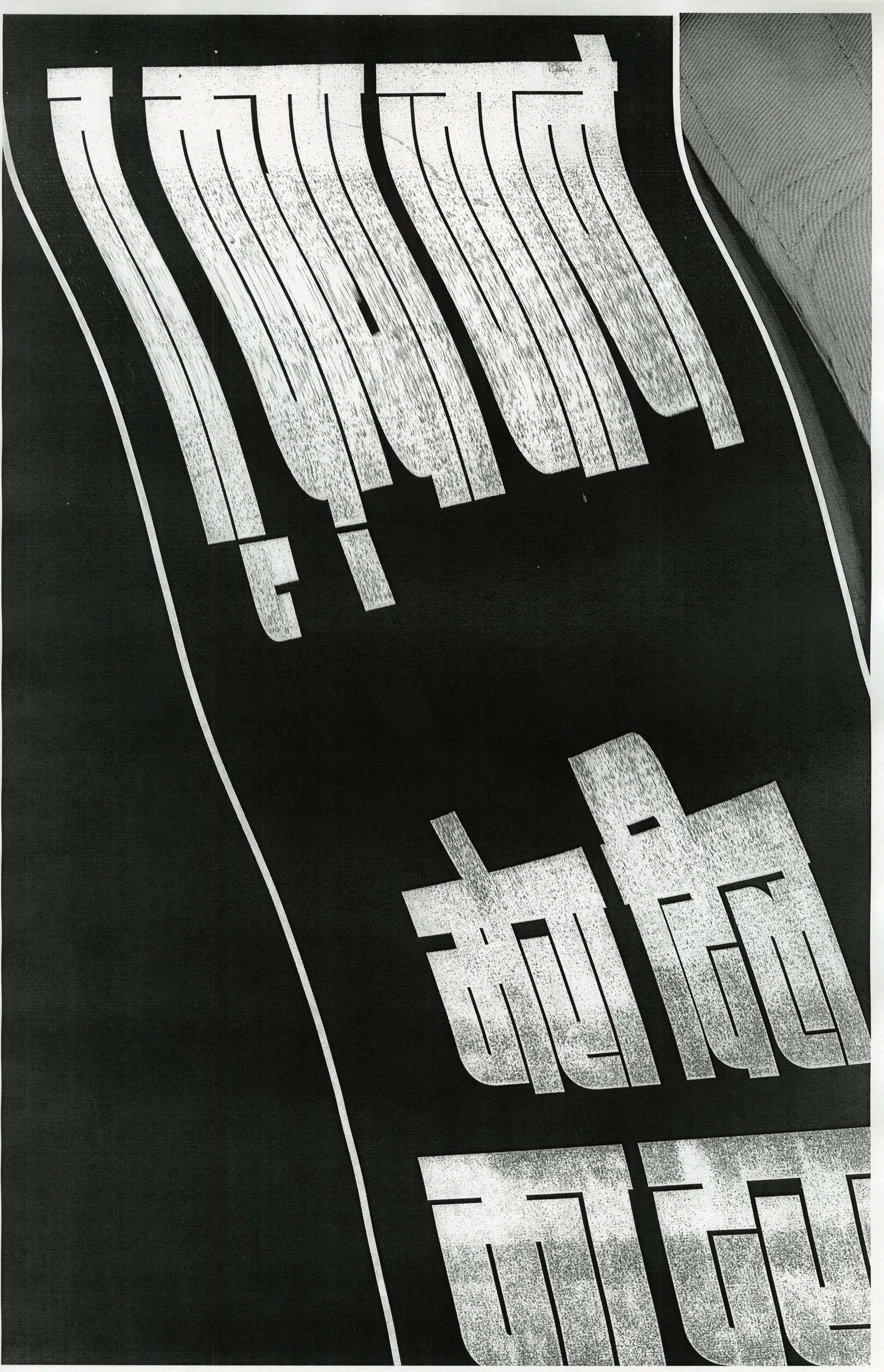
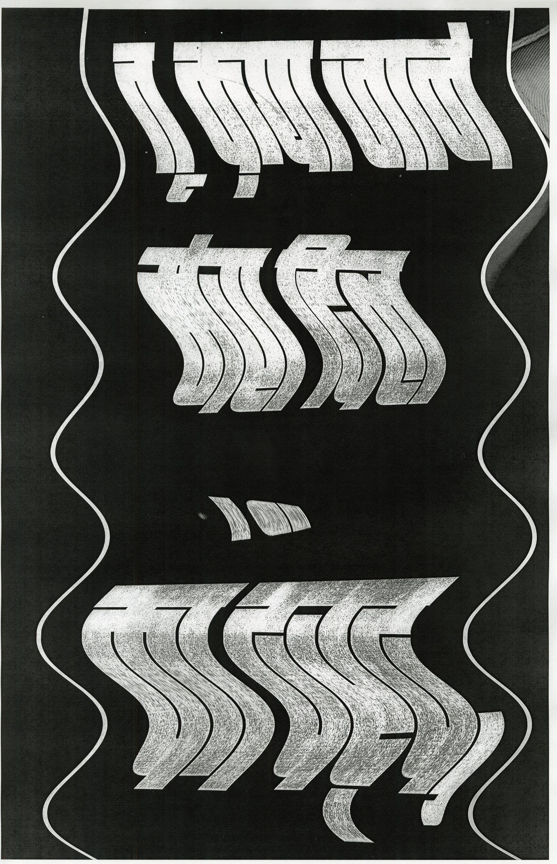
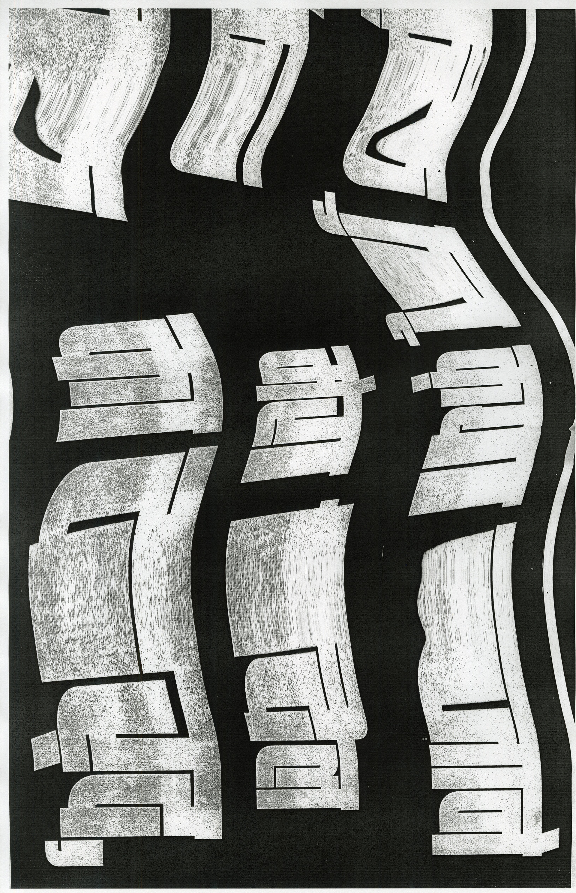
Next, I took the project even further by cutting the type into different shapes with an exacto knife. I also used sharp tools to scrape and distress the type, adding a physicality and texture to the design that couldn’t be achieved purely digitally. These cut paper explorations gave the project a more sculptural quality, reinforcing the themes of manipulation and experimentation.
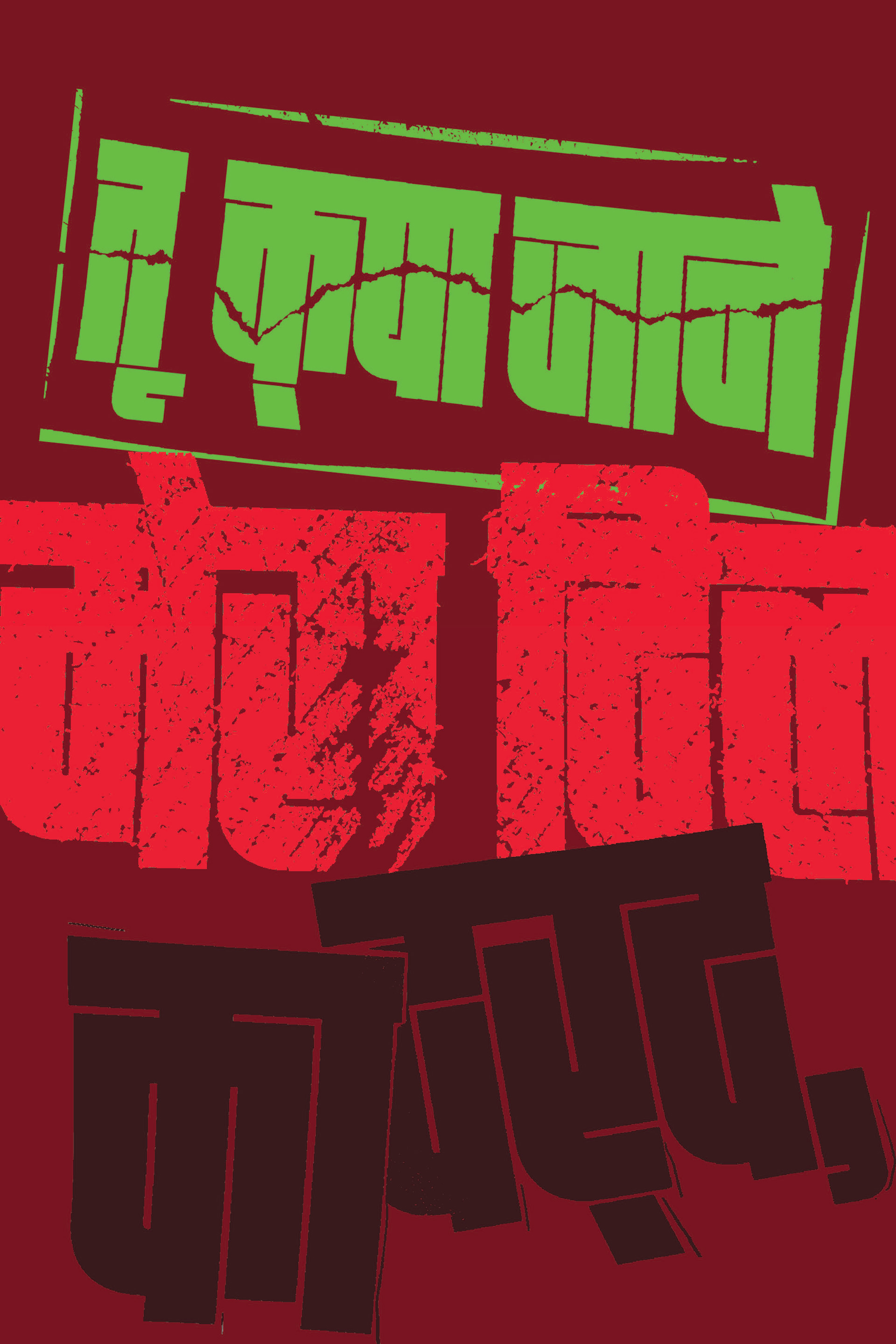
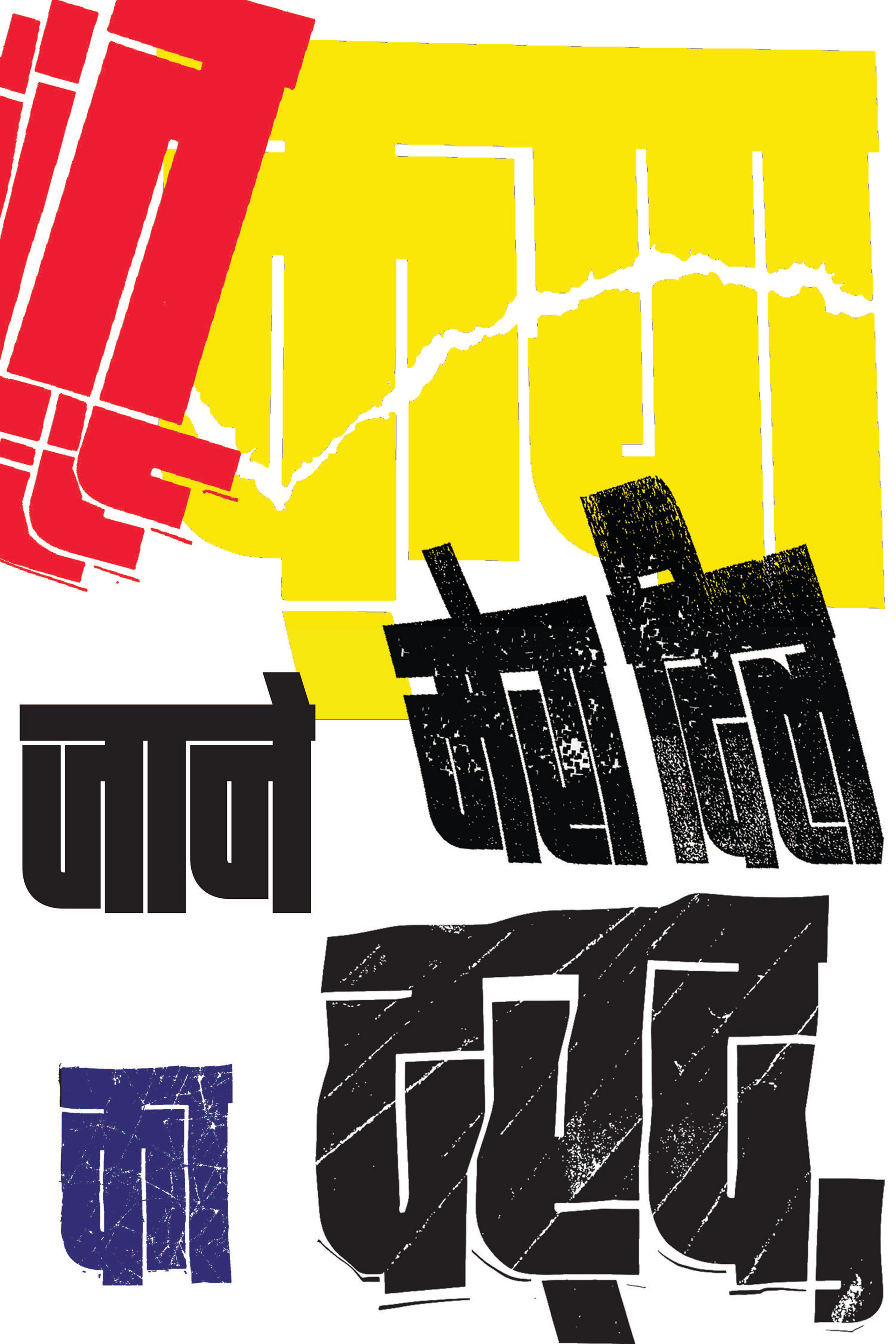
layout explorations
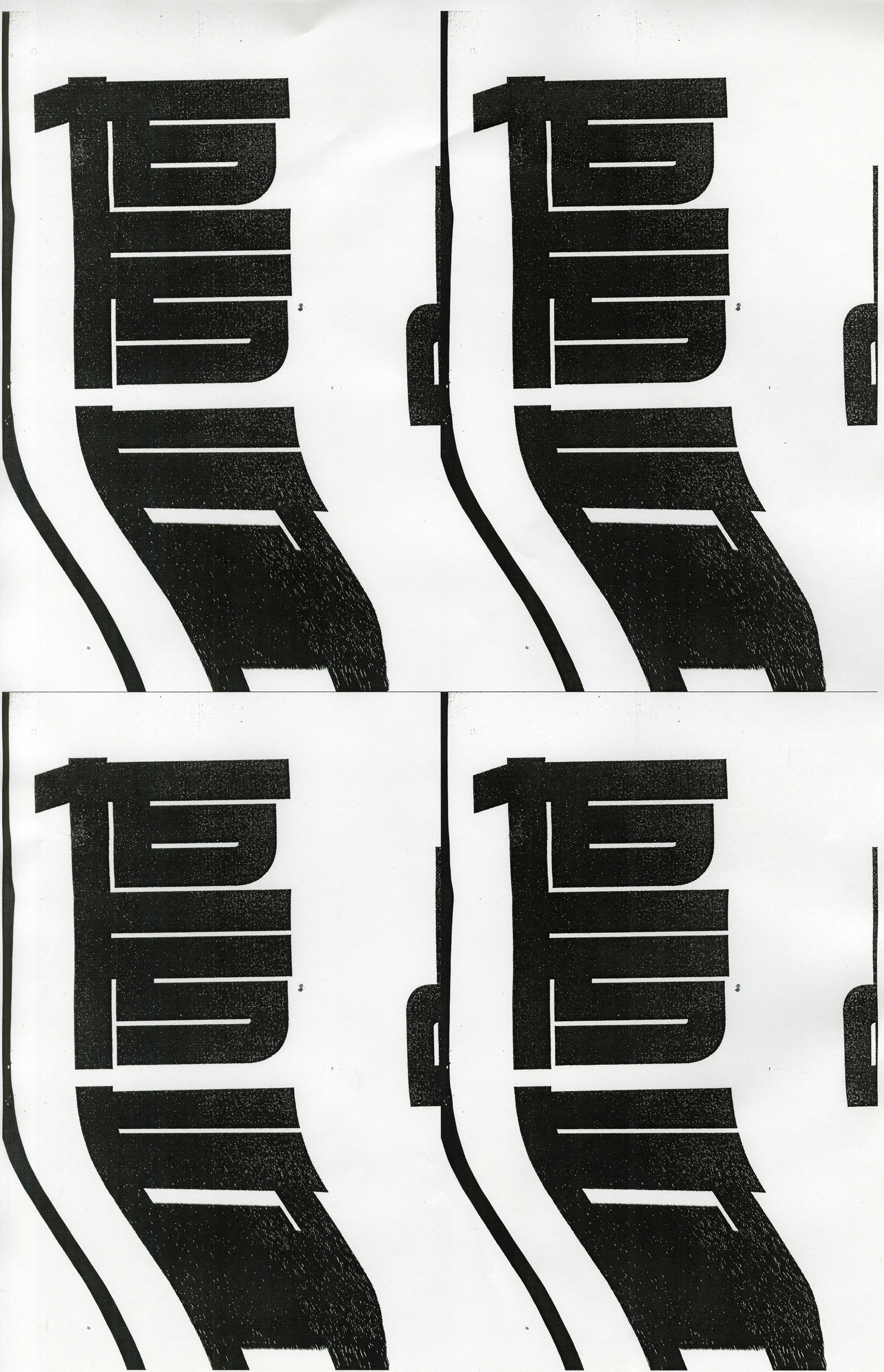
After gathering all these visual elements, I started the process of taking photographs of the manipulated type and editing them digitally to create vector images. The goal was to retain the texture and unique characteristics of the type while converting them into a clean format for layout design. Using these vectors, I played around with different compositions, experimenting with spacing, hierarchy, and the interaction of the type with the overall layout.
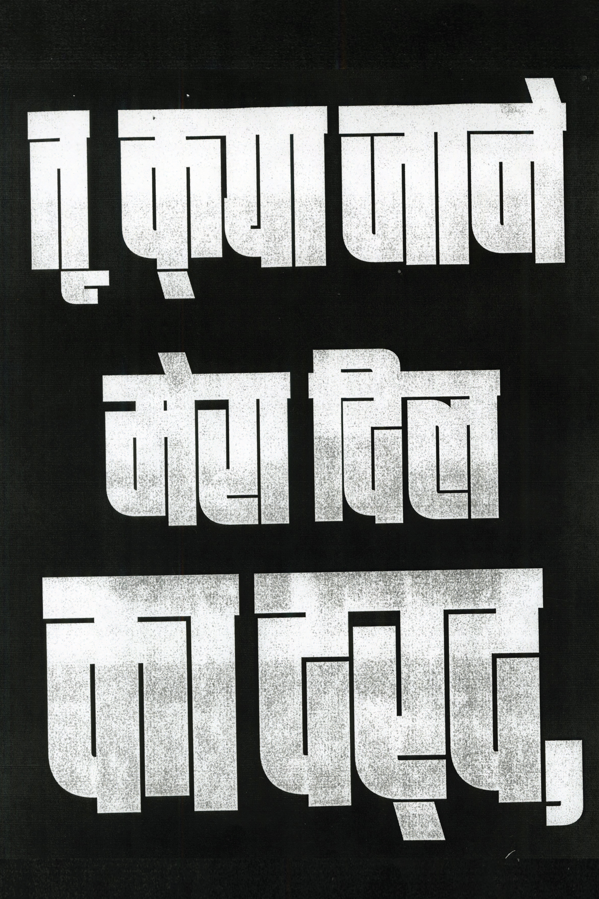
final output
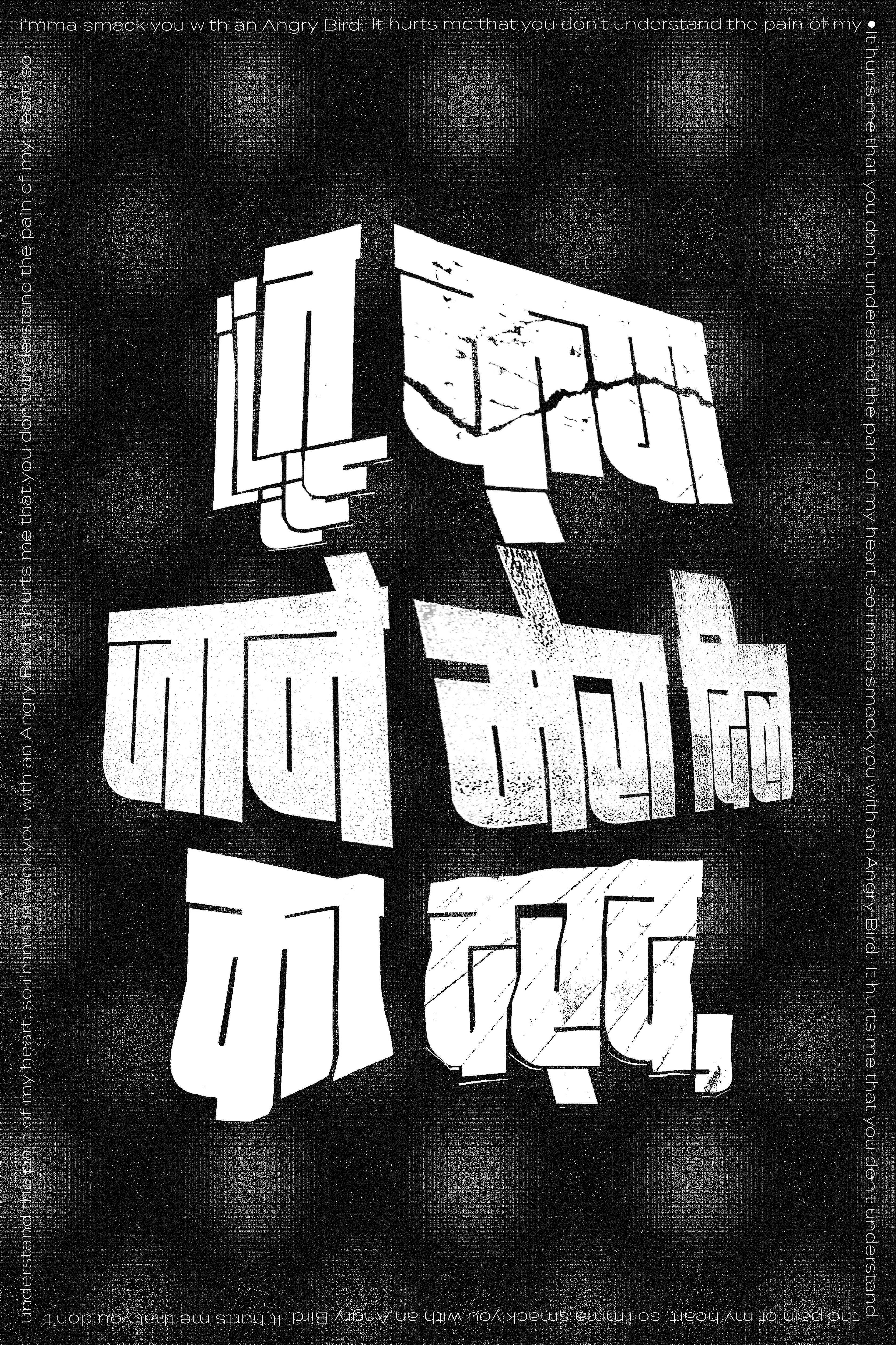
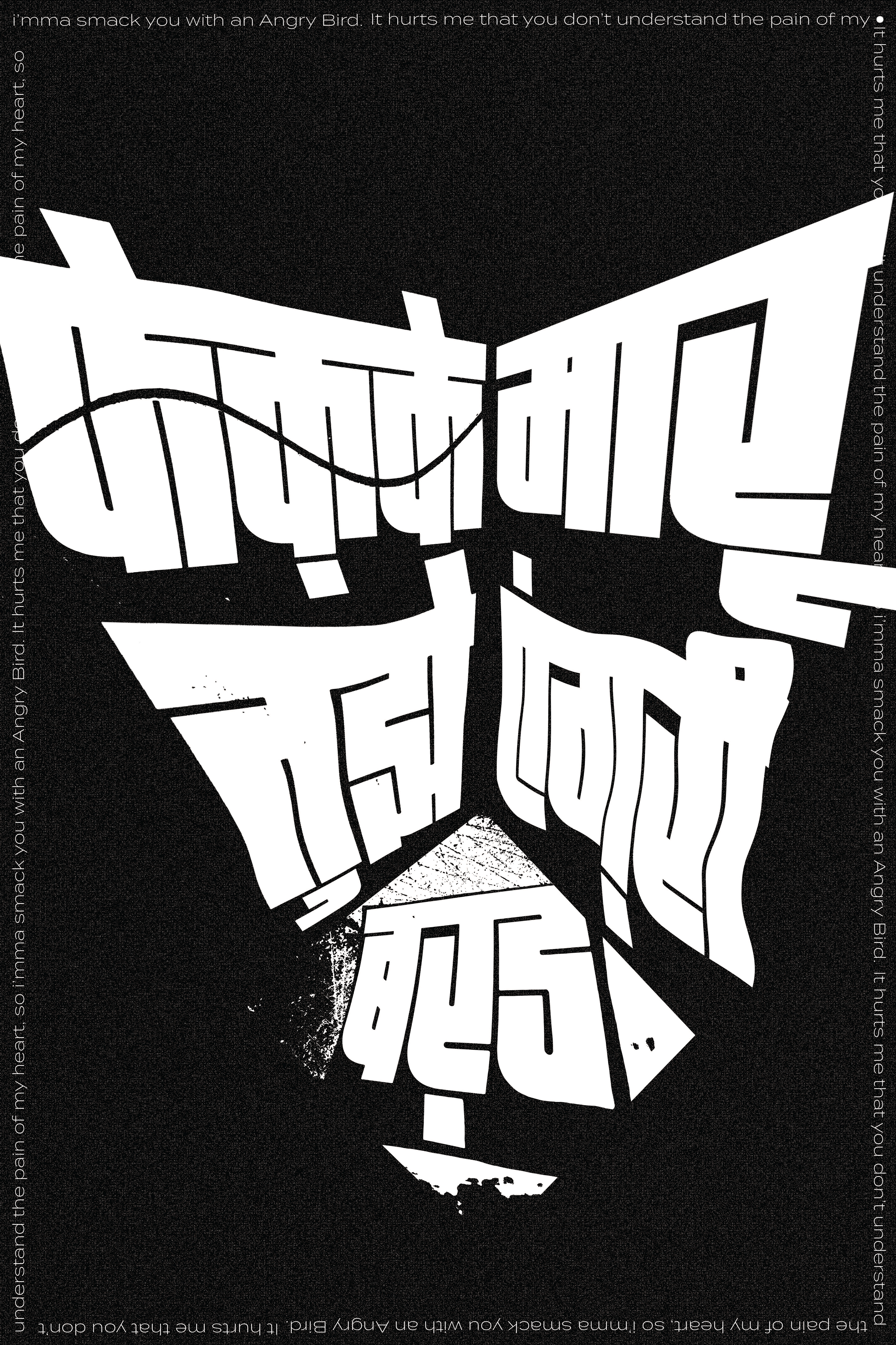
As the project progressed, I began thinking about the audience that might not be familiar with Hindi. To bridge this gap, I translated the phrase into English, positioning it as a complementary graphic element that framed the Hindi text. In my final output, I divided the phrase into two parts, creating a two-part series. The phrase itself is dramatic and theatrical, popularized by a famous Indian YouTuber, adding an element of pop culture to the project.